ward before + afters
/Looking back through these pictures to start this post was so fun! We actually finished this project over a year ago, but with so many new projects in the works I wanted to get the blog caught up. We love looking at before + after pictures so hopefully these are entertaining to someone else too! We were so excited to get our hands on this project. .
The house was situated on a beautiful lot in an adorable neighborhood. As the house itself was a little boring, our objective was to give the exterior some character. We wanted to do justice to the neighborhood, as well as the home. We pulled out the porch to add a sitting area and also give the house some dimension. The shutters painted white gave the house another layer of design without taking away from the new porch. I love how this came together!
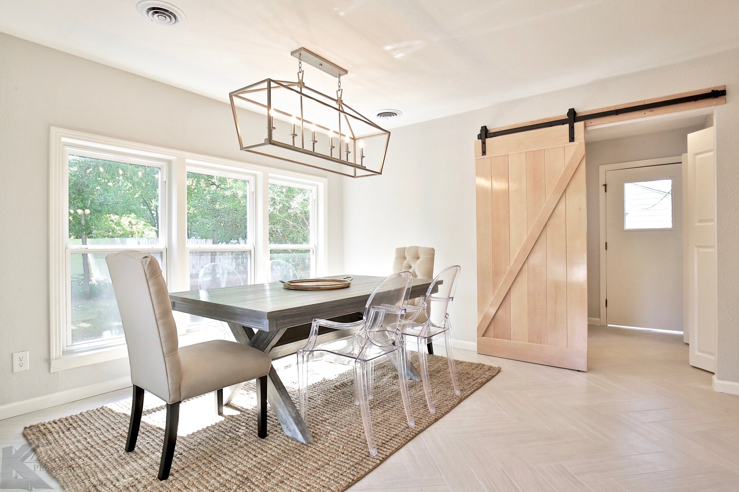
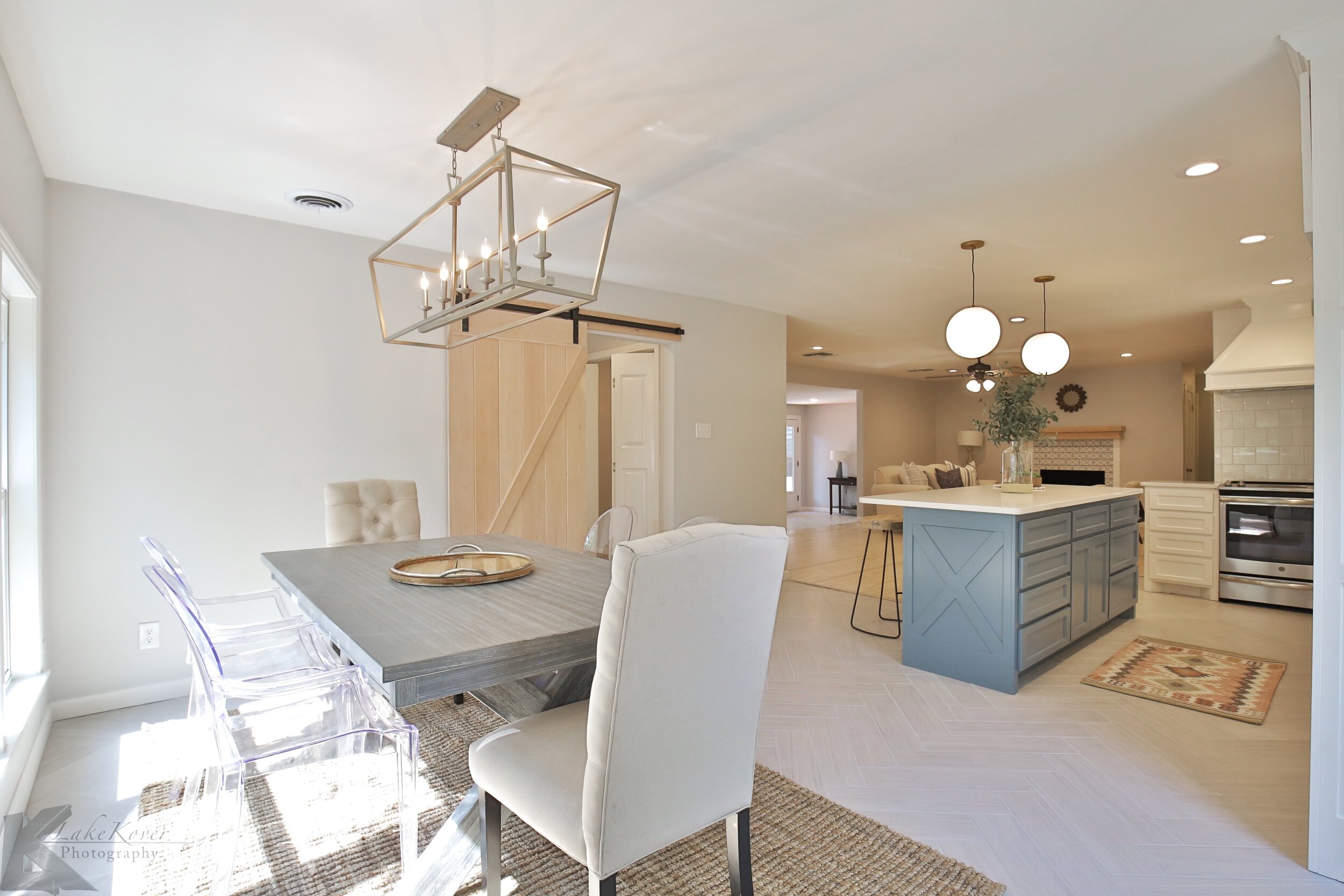
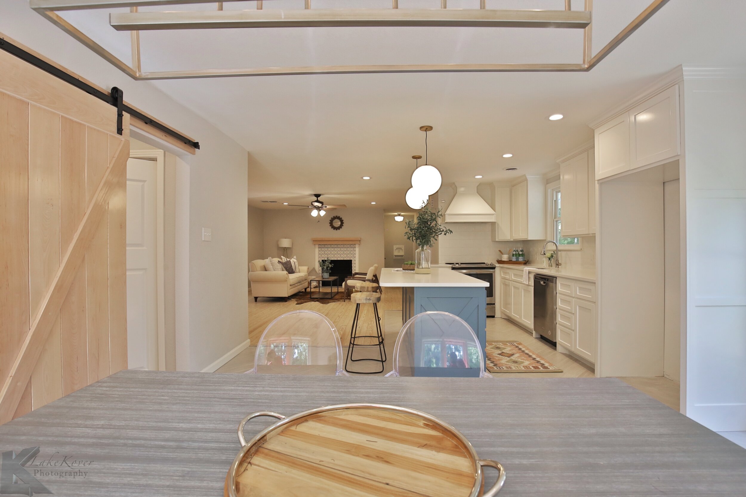
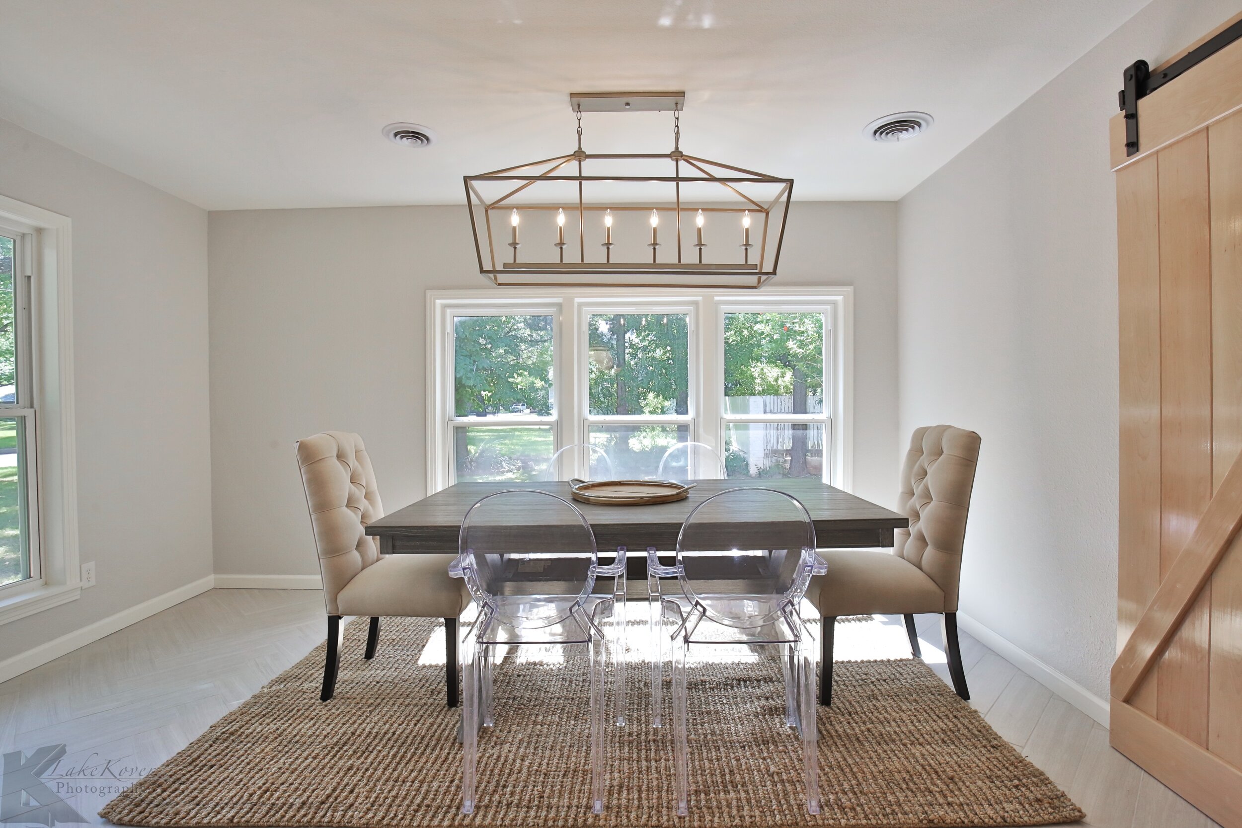
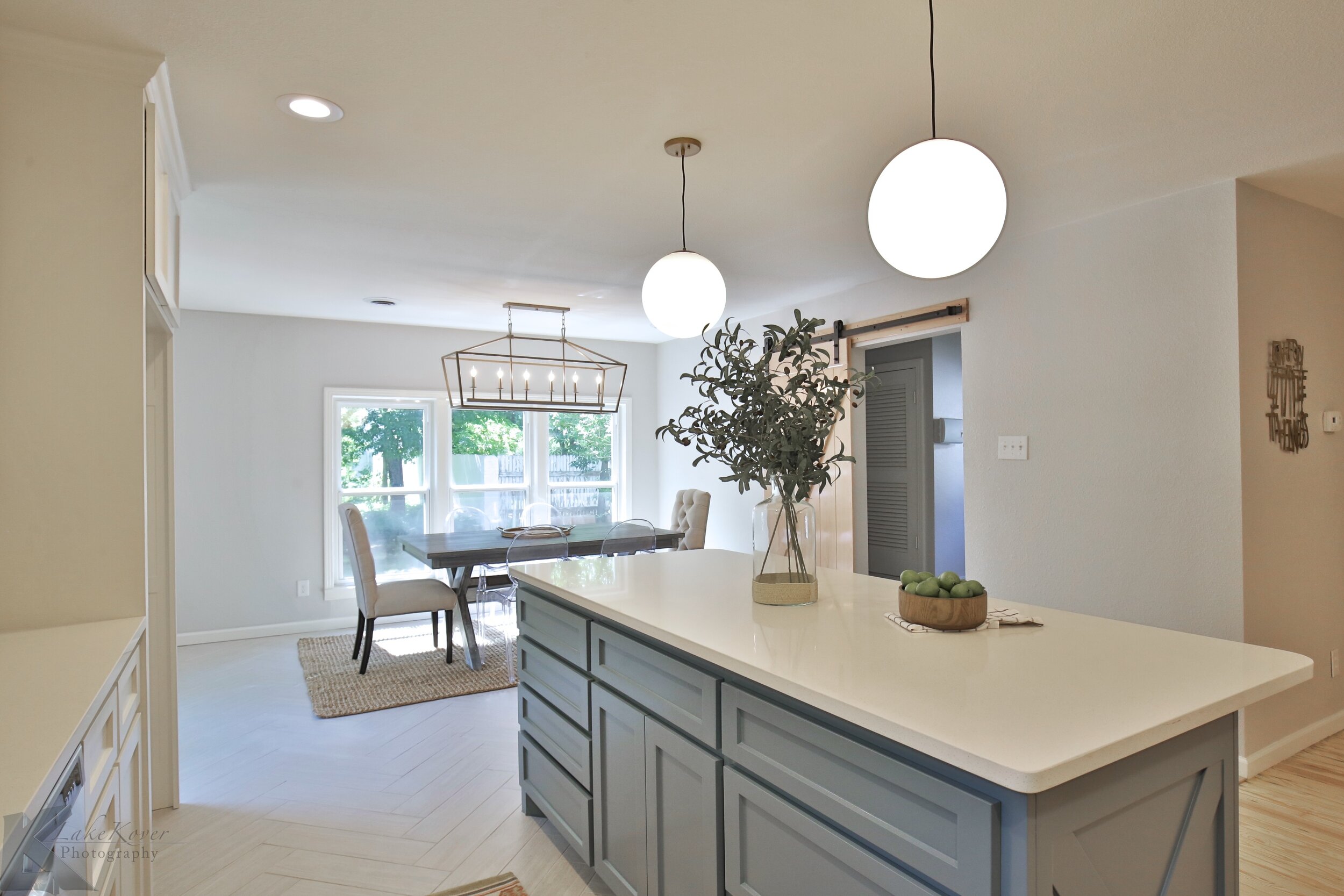
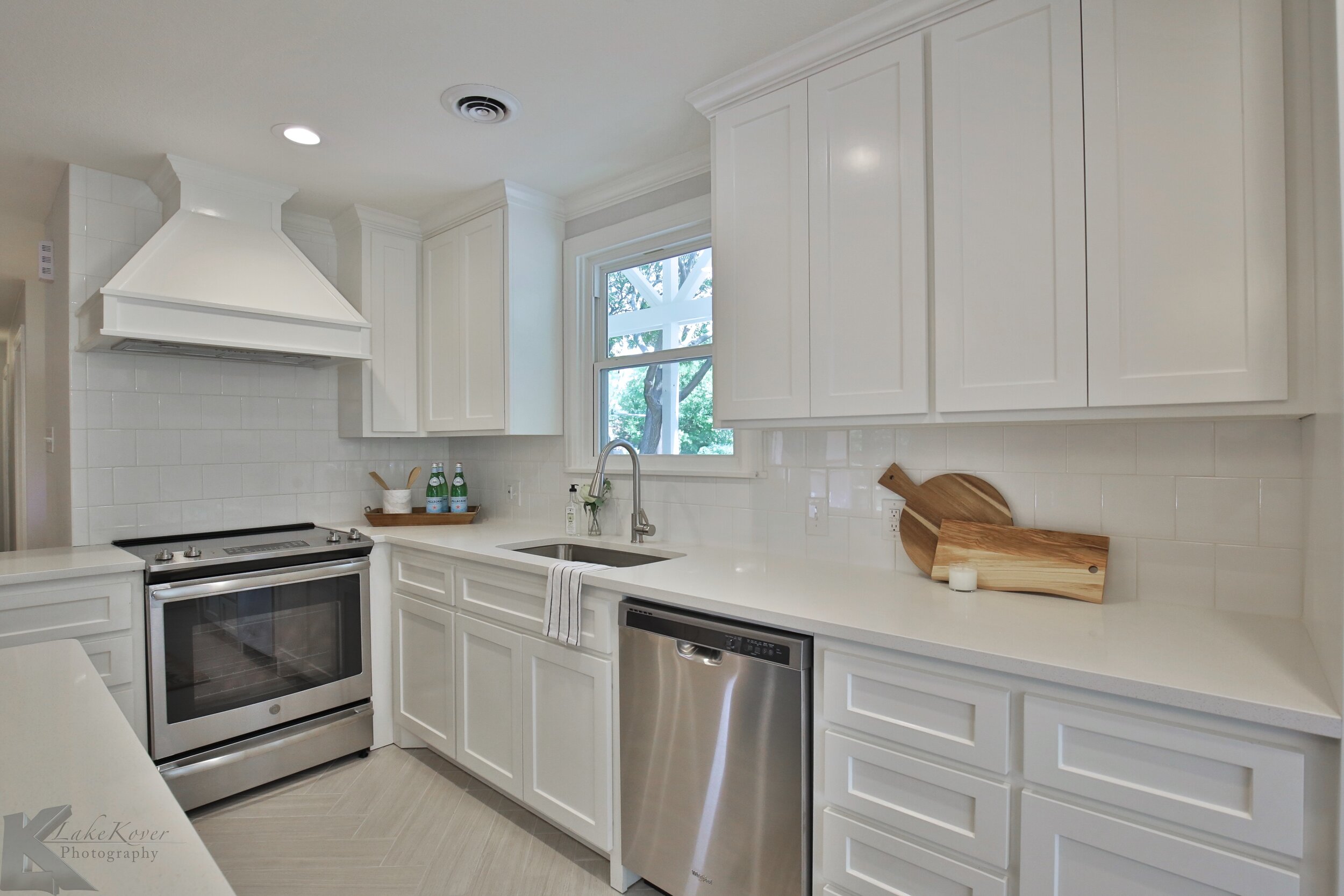
In the kitchen and dining space we opened up a couple walls into the living area and we also added a wall to close off the laundry area Its hard to see here, but we added a grey tile in a herringbone pattern throughout the kitchen!
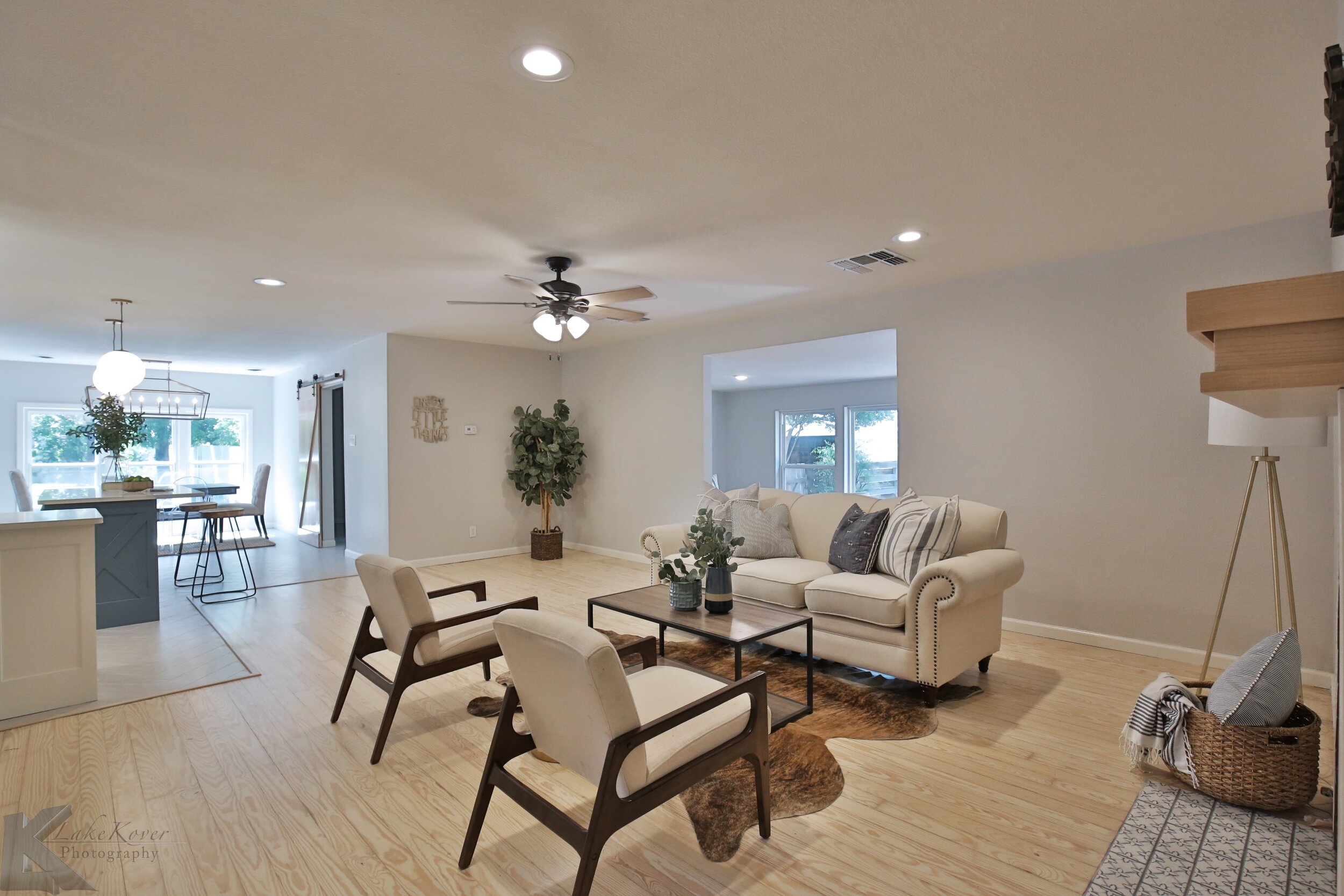
Both pictures are taken from the same spot! This really shows the walls that were knocked out to create this beautiful open concept space.
The living area had a door that closed off the hallway, opening up that door and making the sheetrock flush to the ceiling made the space look so much bigger. On the other side of the room is a step down into an enclosed porch. As much as it let in beautiful light, we thought defining these spaces and closing up the walls was going to be more appealing. And the holy grail in house flipping: finding these hardwoods under carpet!
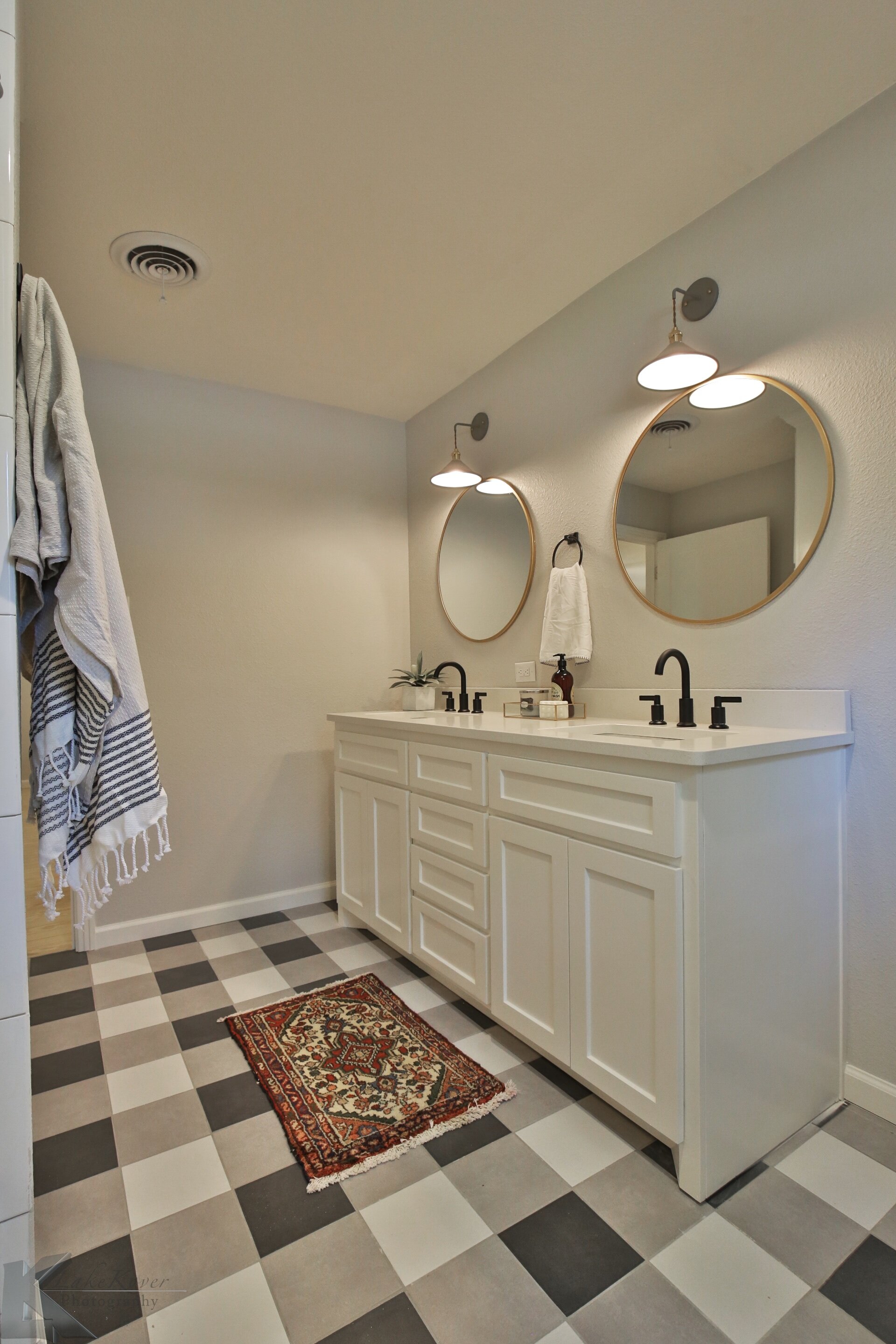
This hall bathroom was a little odd. It snaked around with a small vanity, a makeup counter, and a linen closet. It had a lot going on and was totally cramped. Moving the doorway to the other side we were able to create a layout that flowed much better! We used 3 different colors of tile to create this buffalo check look on the floors #hearteyes.
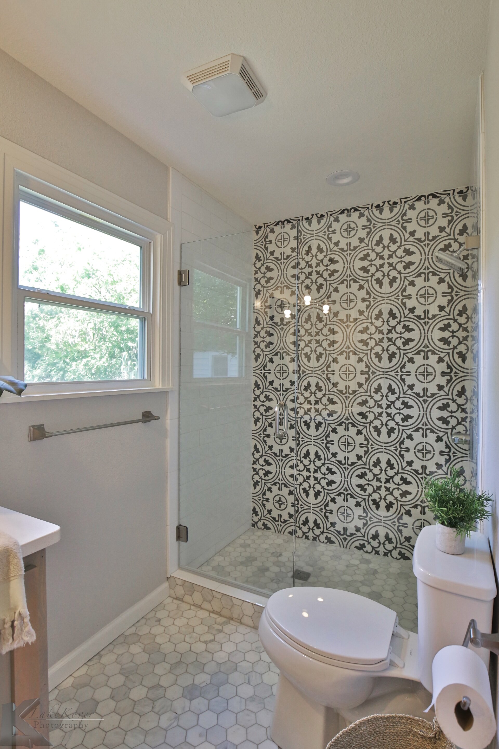
You cant tell from the pictures, but in order to get into the master bathroom you had to walk through a small closet. Again, we took out some walls and reworked the layout in this bathroom. The vanity was also made out of beech wood and we used a natural stain #swoon. We had enough room in the master bedroom to build out a new closet so it was a win win.
What a fun project! We are thankful to have the opportunity to work in such a beautiful neighborhood!


