green acres before + afters

9U6A7525.jpeg

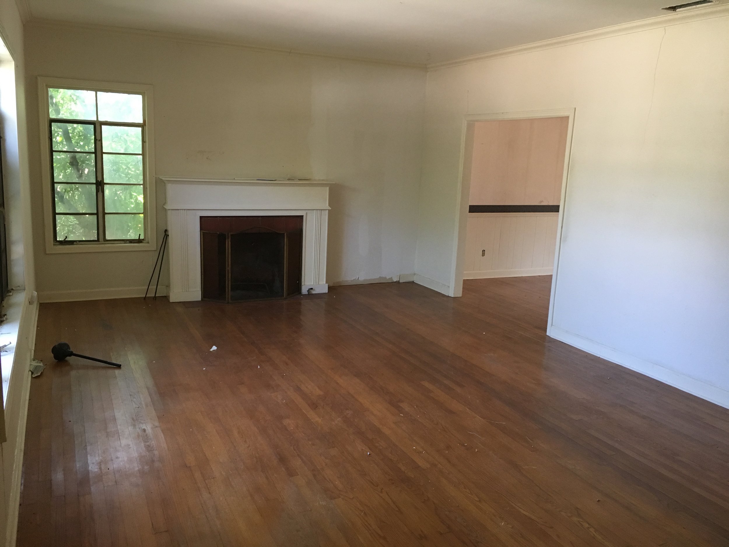
This home was SO MUCH work! And if we’re being honest, Im not sure we were that excited about buying it. It was one of the worst kind of houses we see as it had been hodge podged together for many many years. I think it had 3 different “additions” on the house that all had to be torn down. Needless to say, the demo on this project was extensive! But in the end, the house was able to be transformed into something to be proud of and we sold it to a young and growing family.

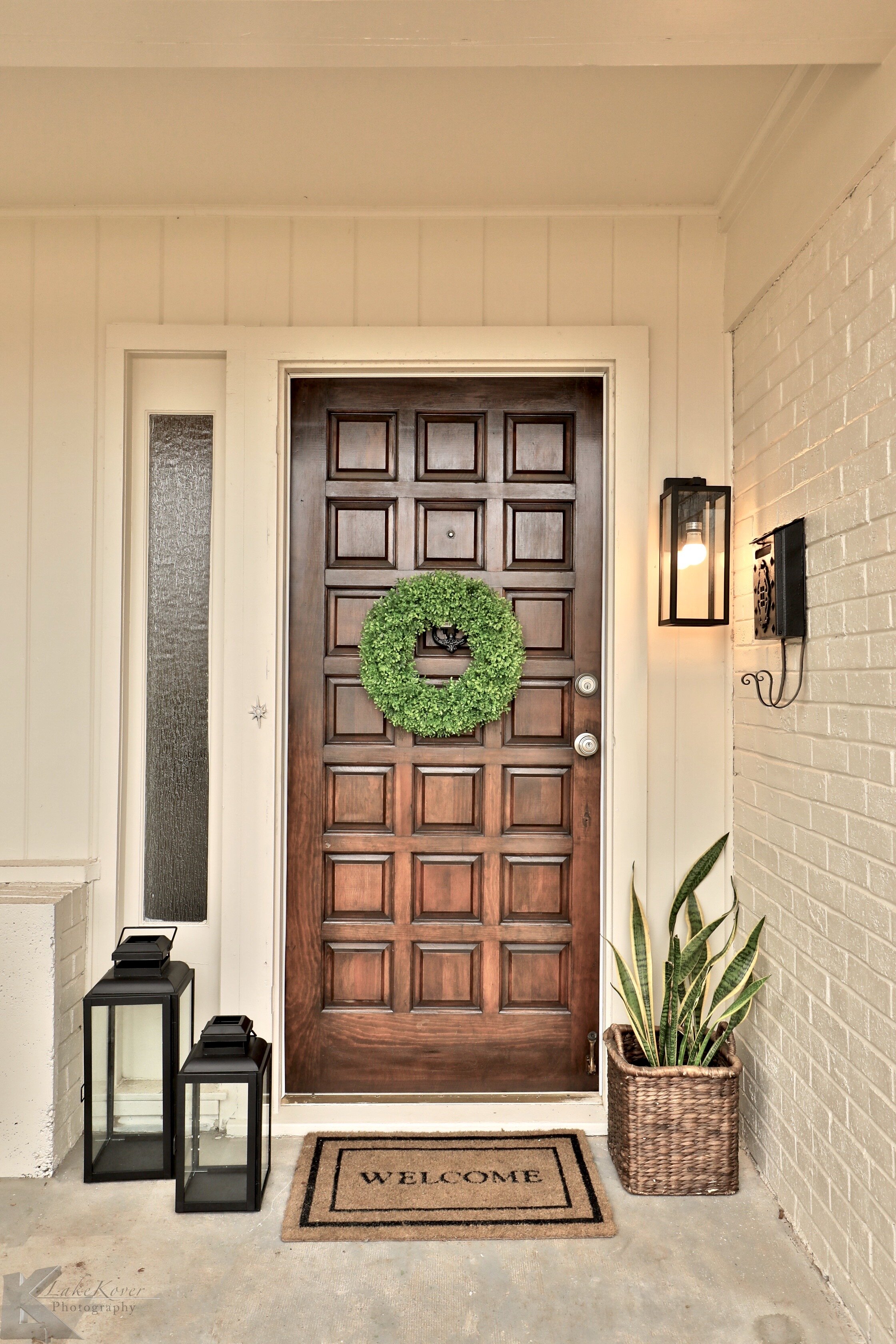
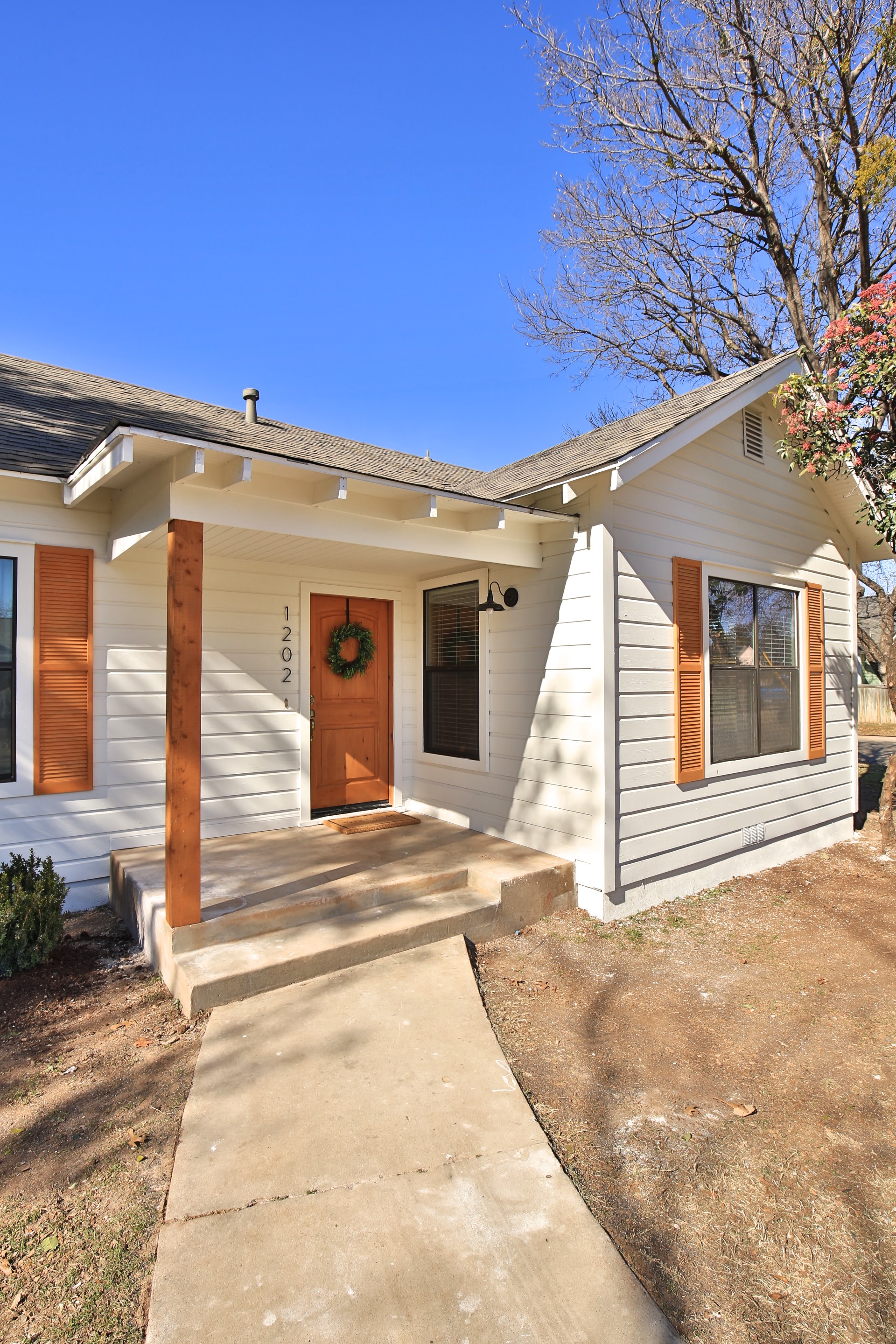
But, it had this cute front door that we saved! It was a gorgeous solid wood door and had all the character. We painted the exterior a creamy white with a darker taupe trim color.

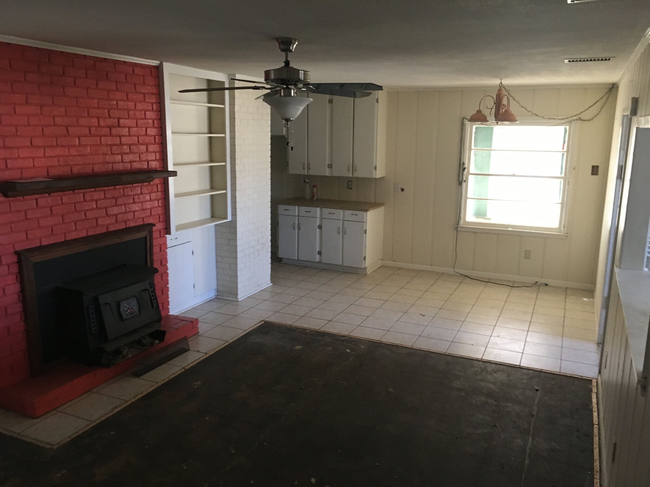
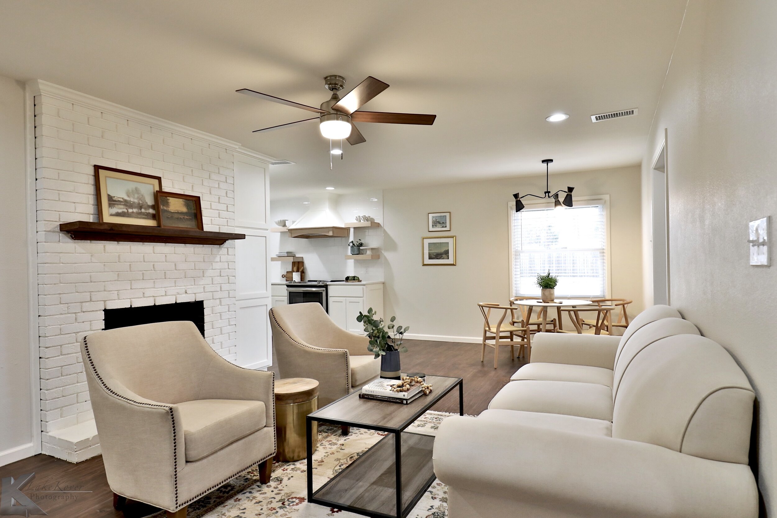
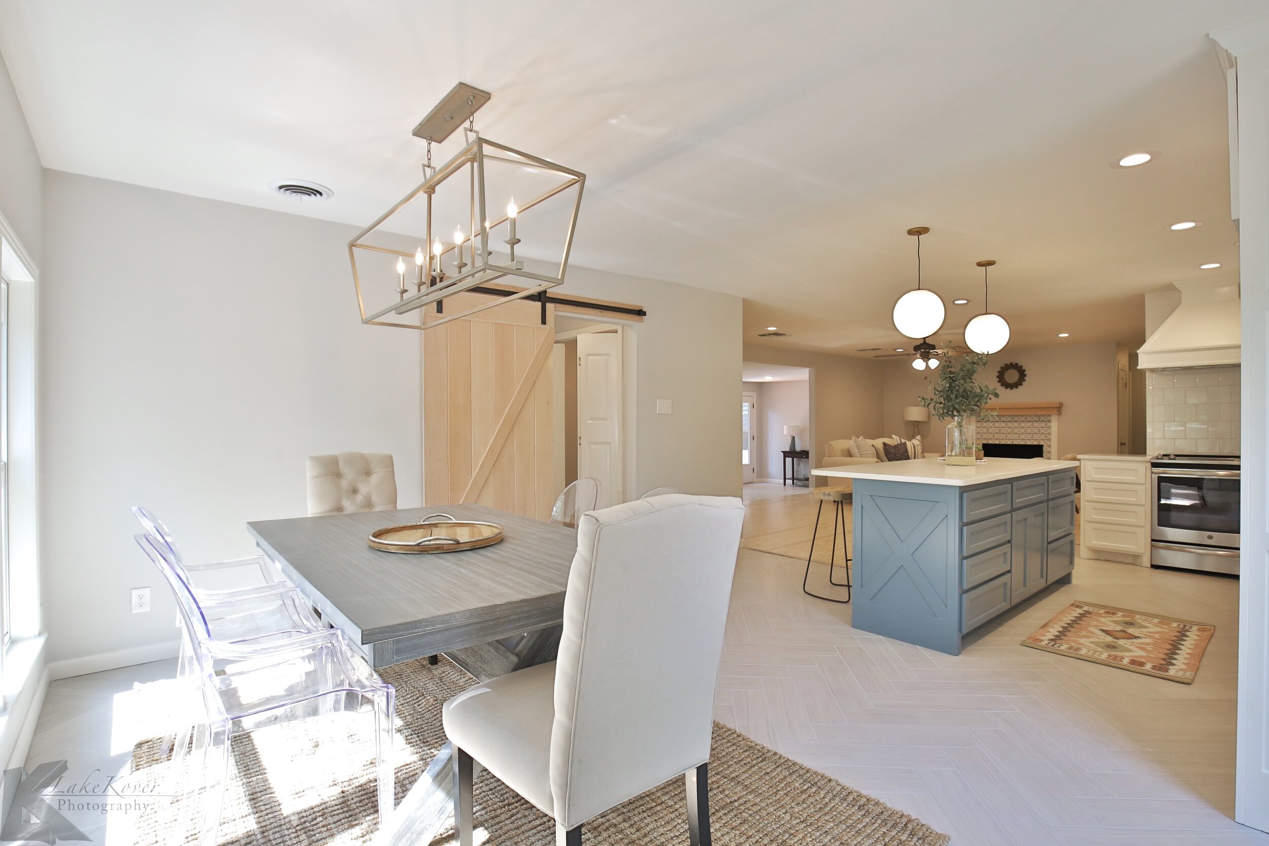
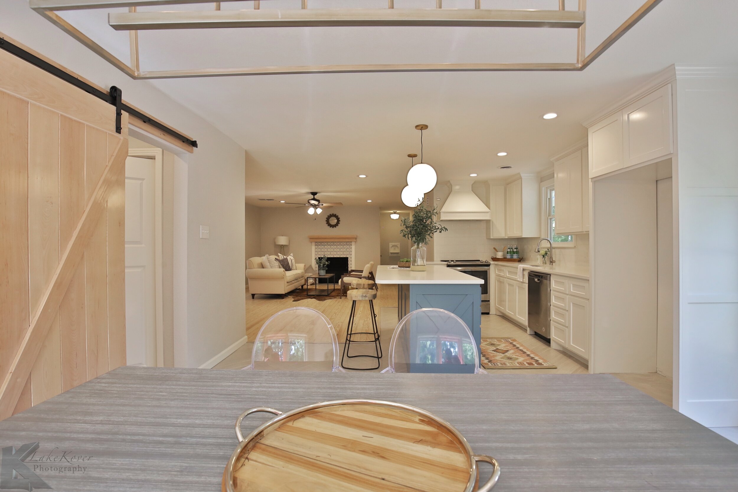
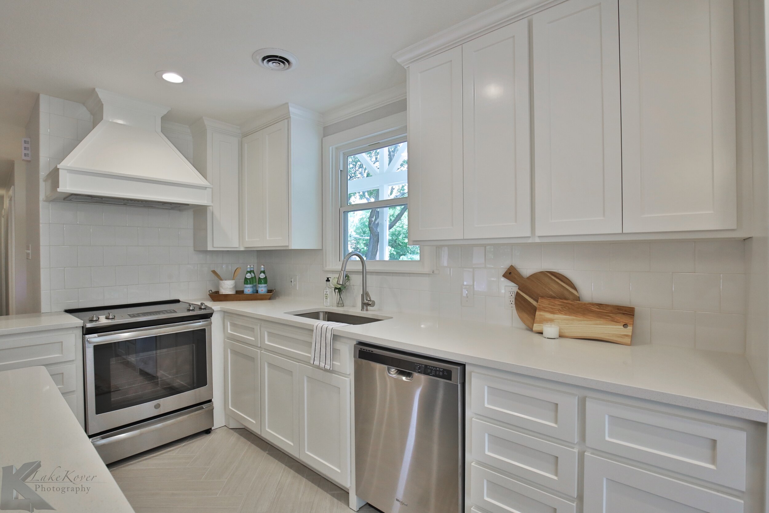
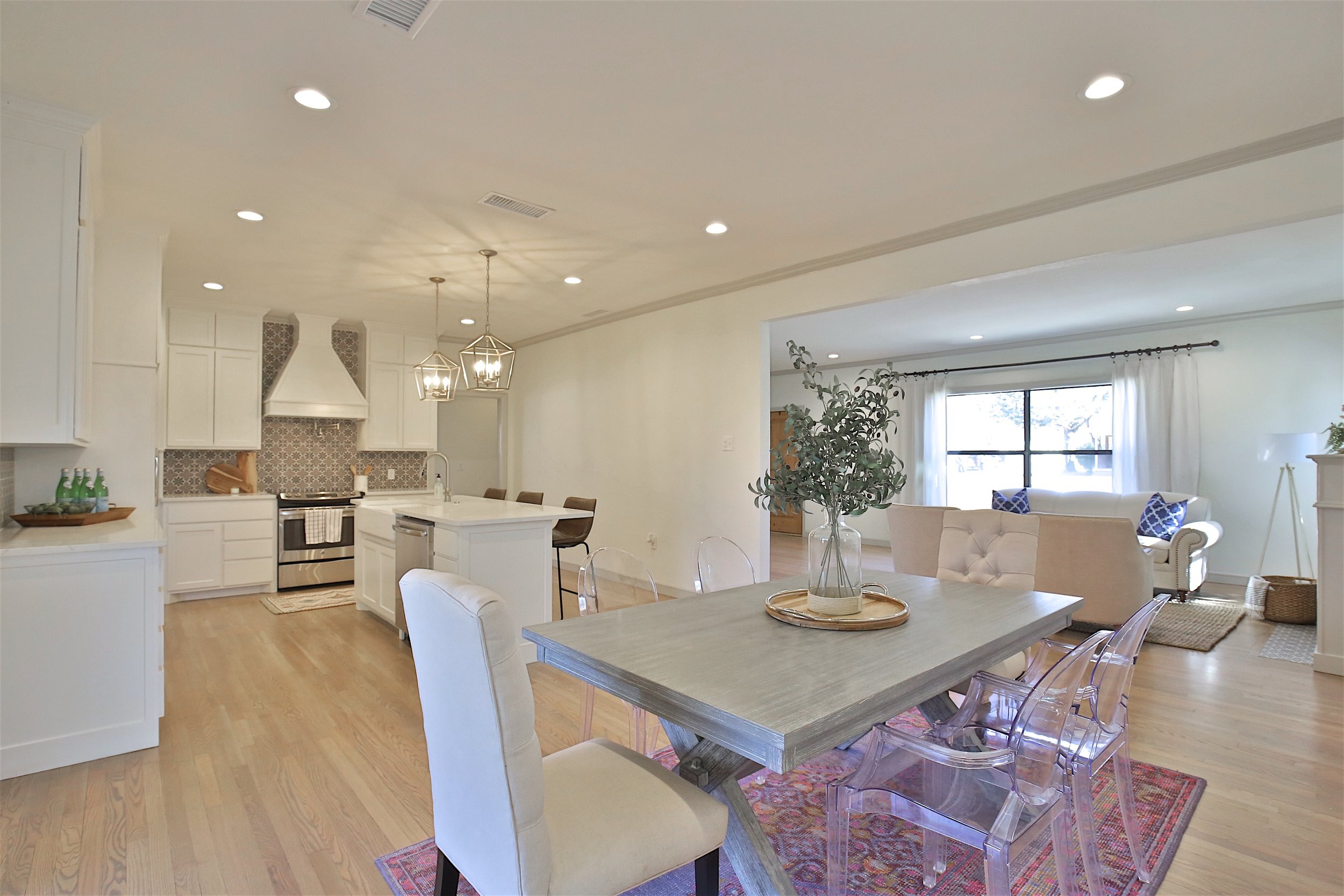
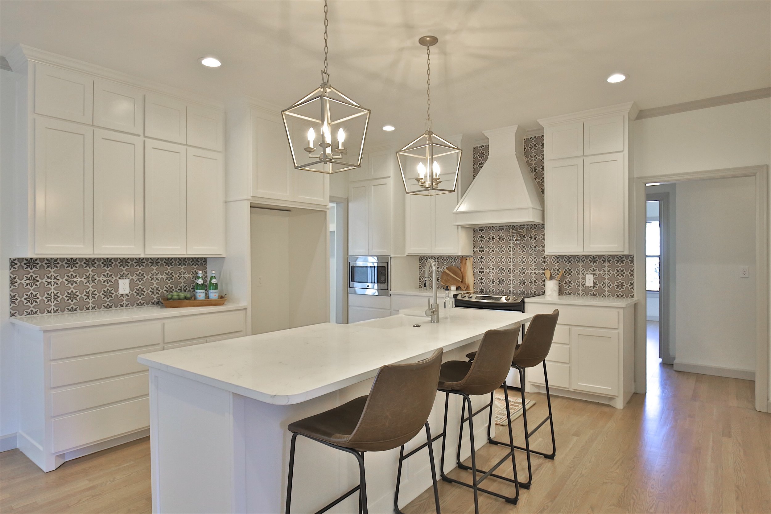
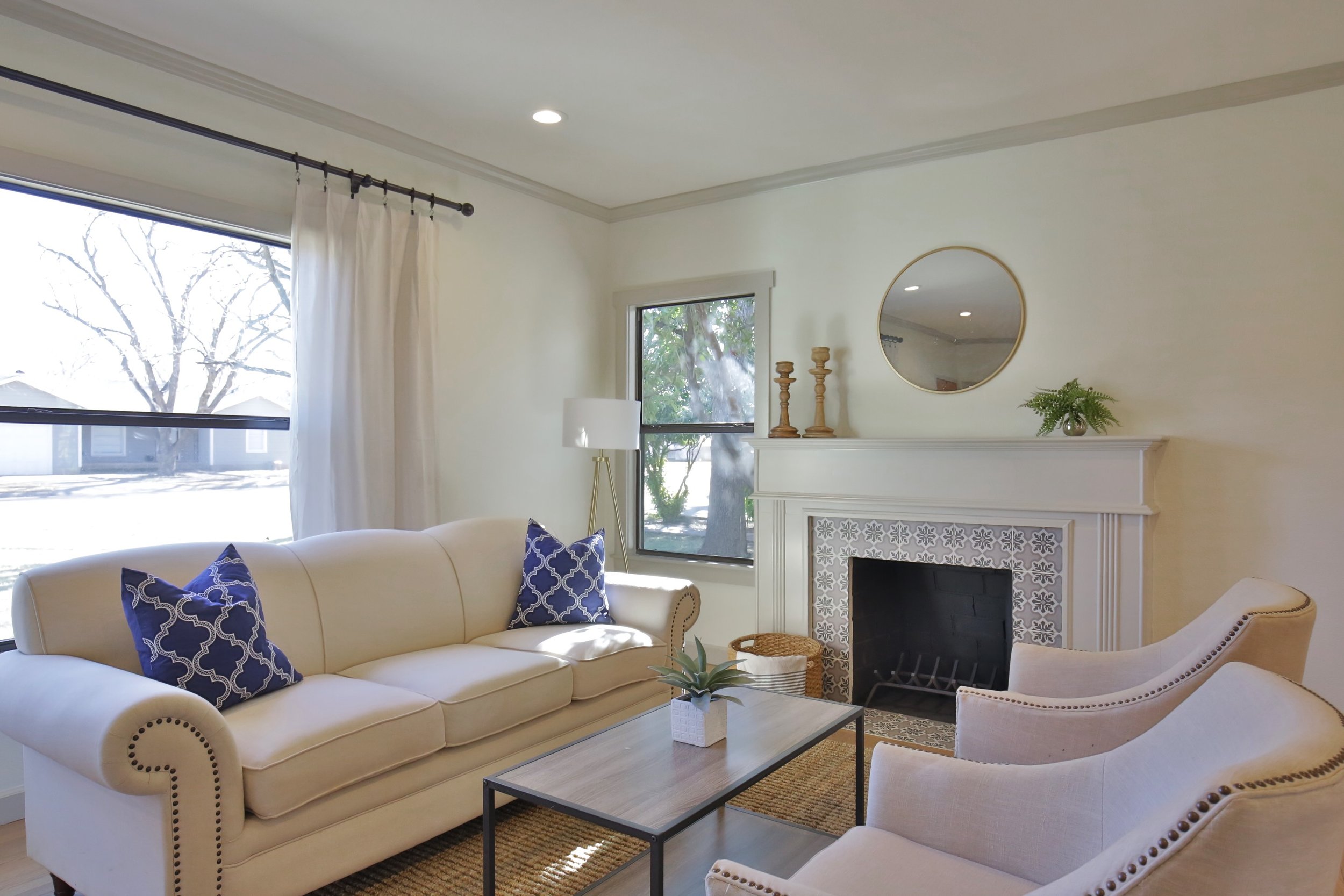
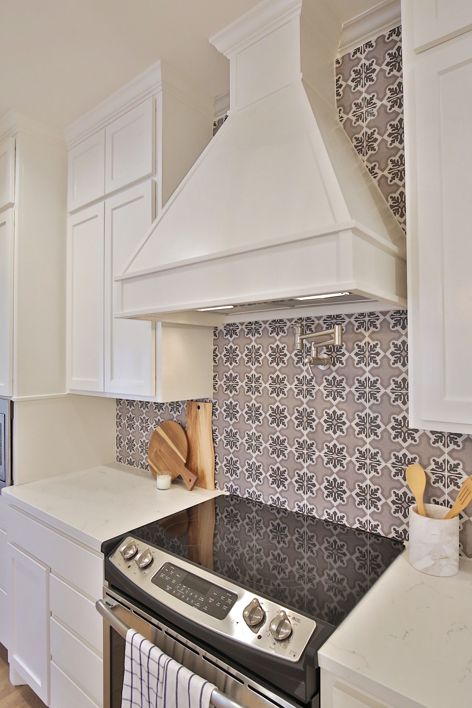
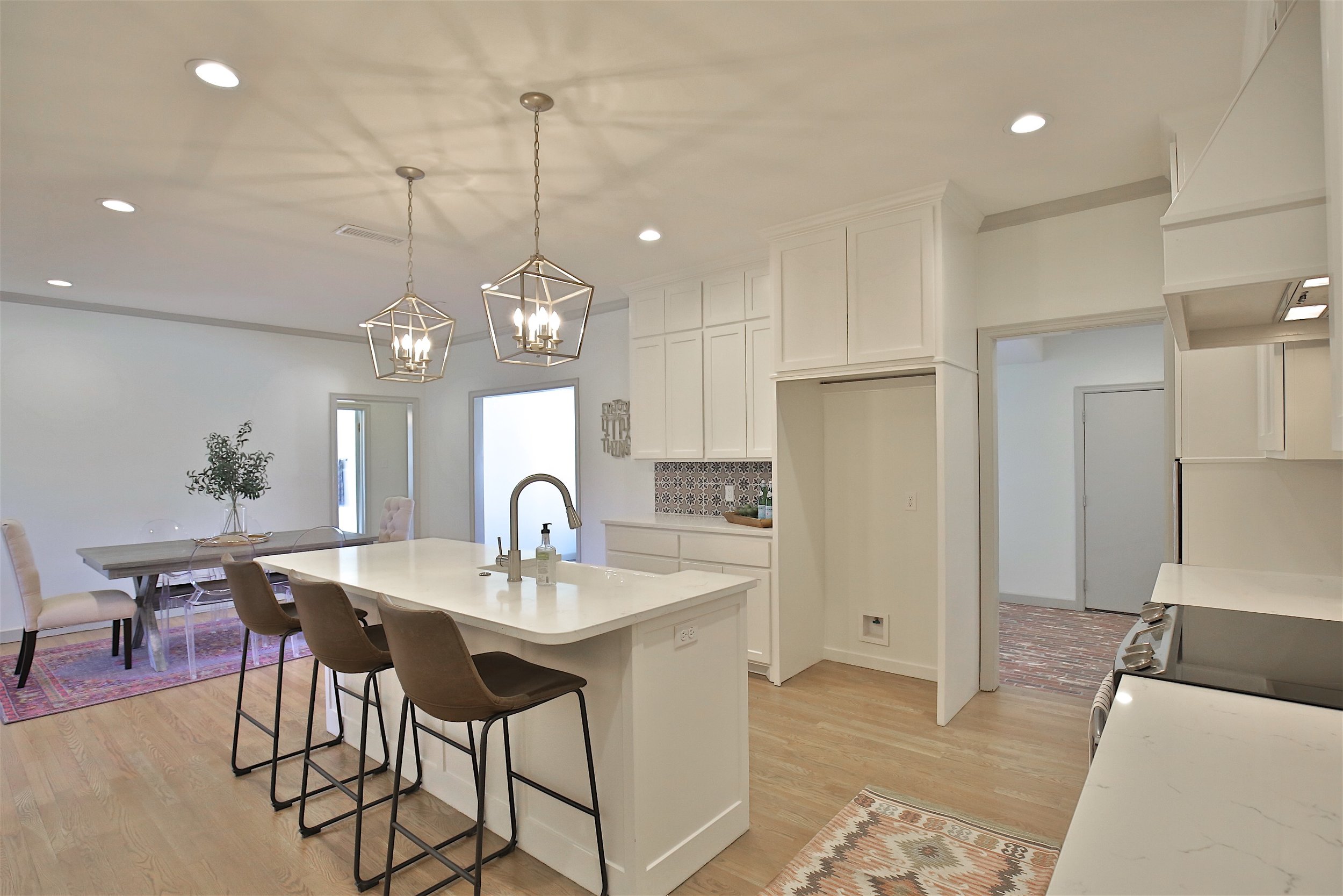
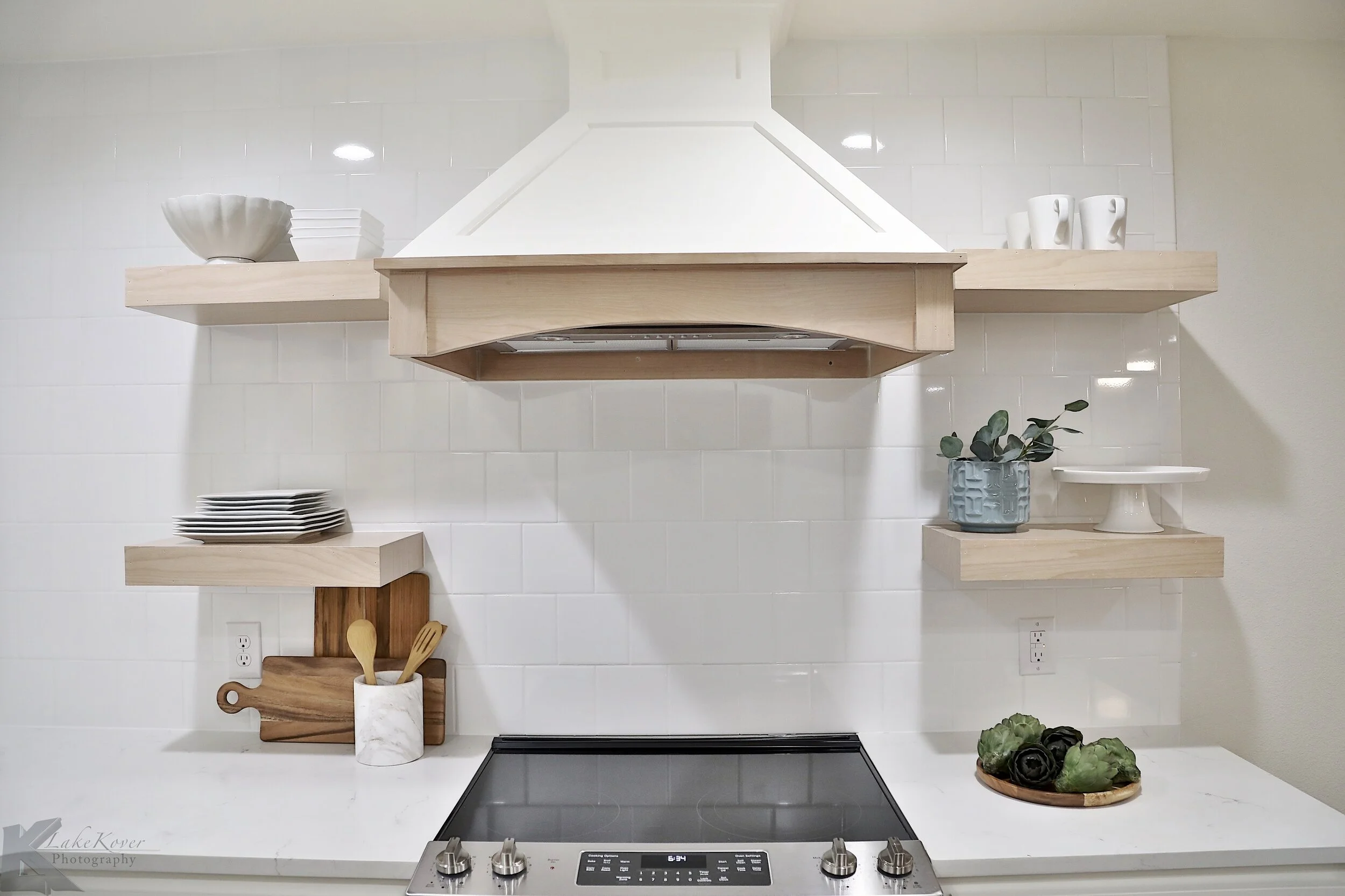
The brick fireplace turned out so cute with just some paint! All of the kitchen was demo’ed and its corkiness. We opened up the flow little bit in this area by coming back with less bulky cabinets. And keeping the uppers really simple and open helped the space feel bigger.

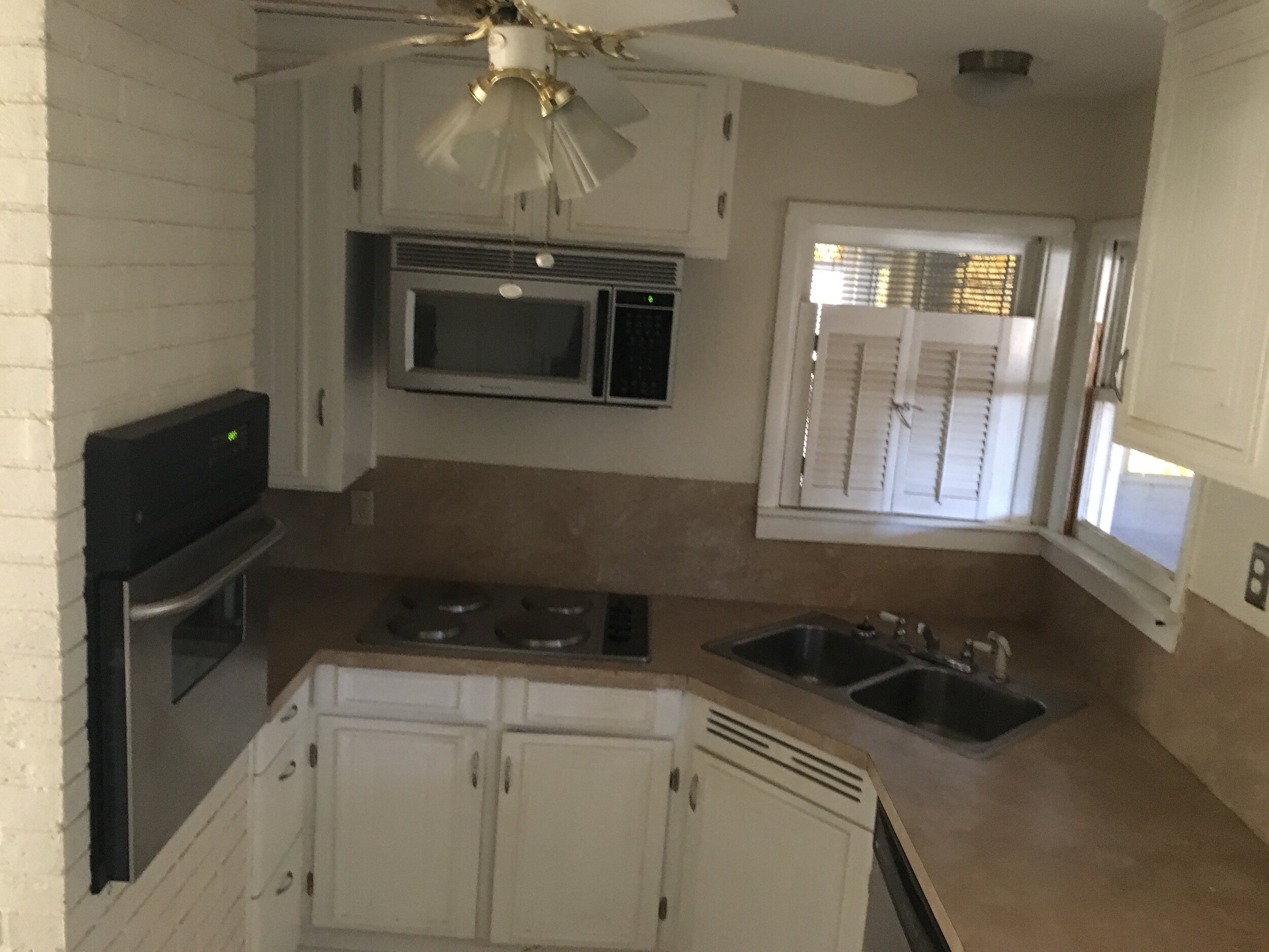
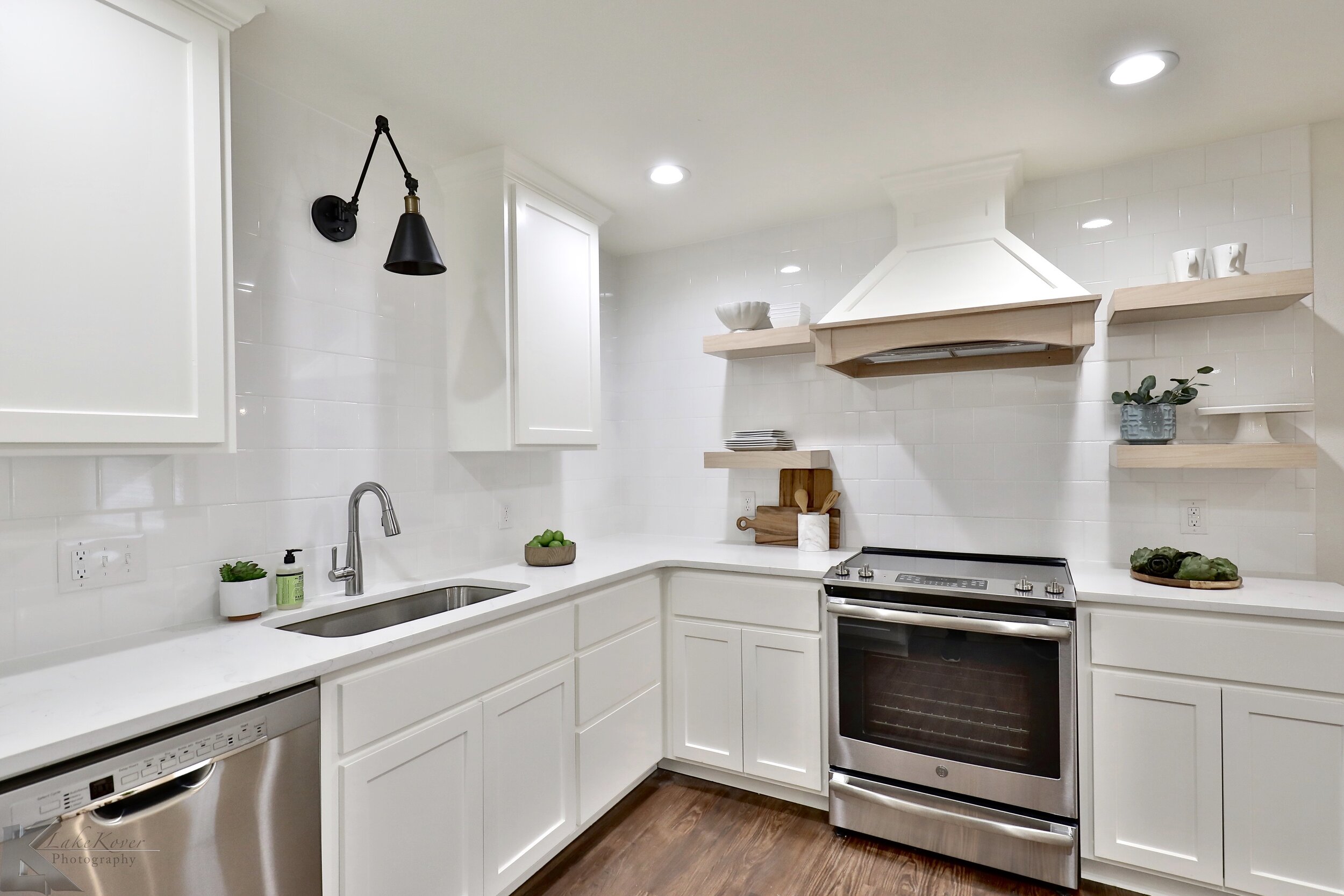
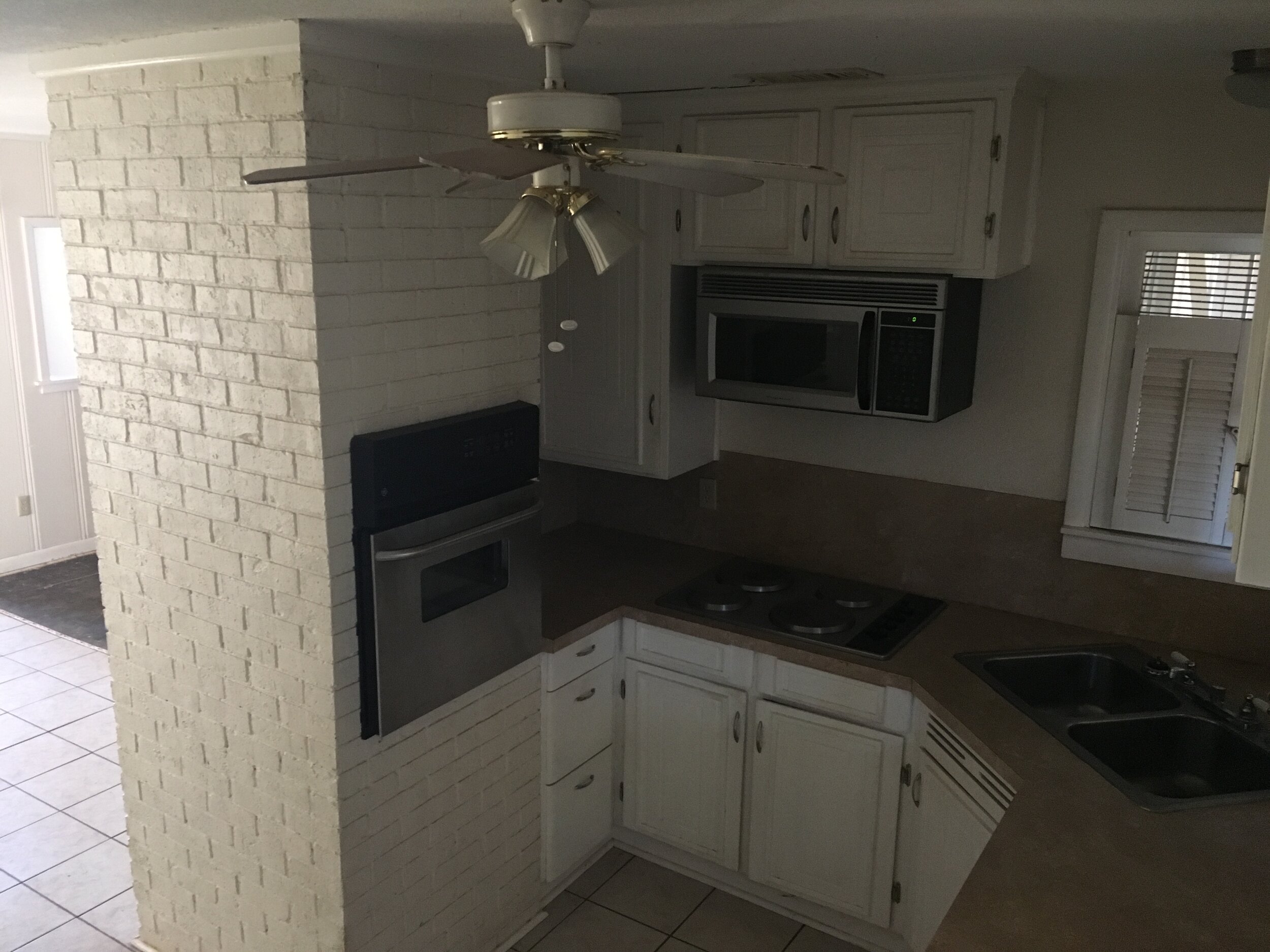
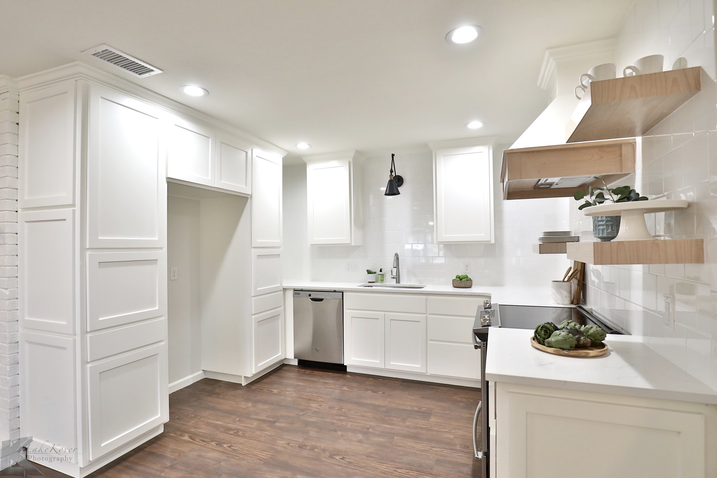
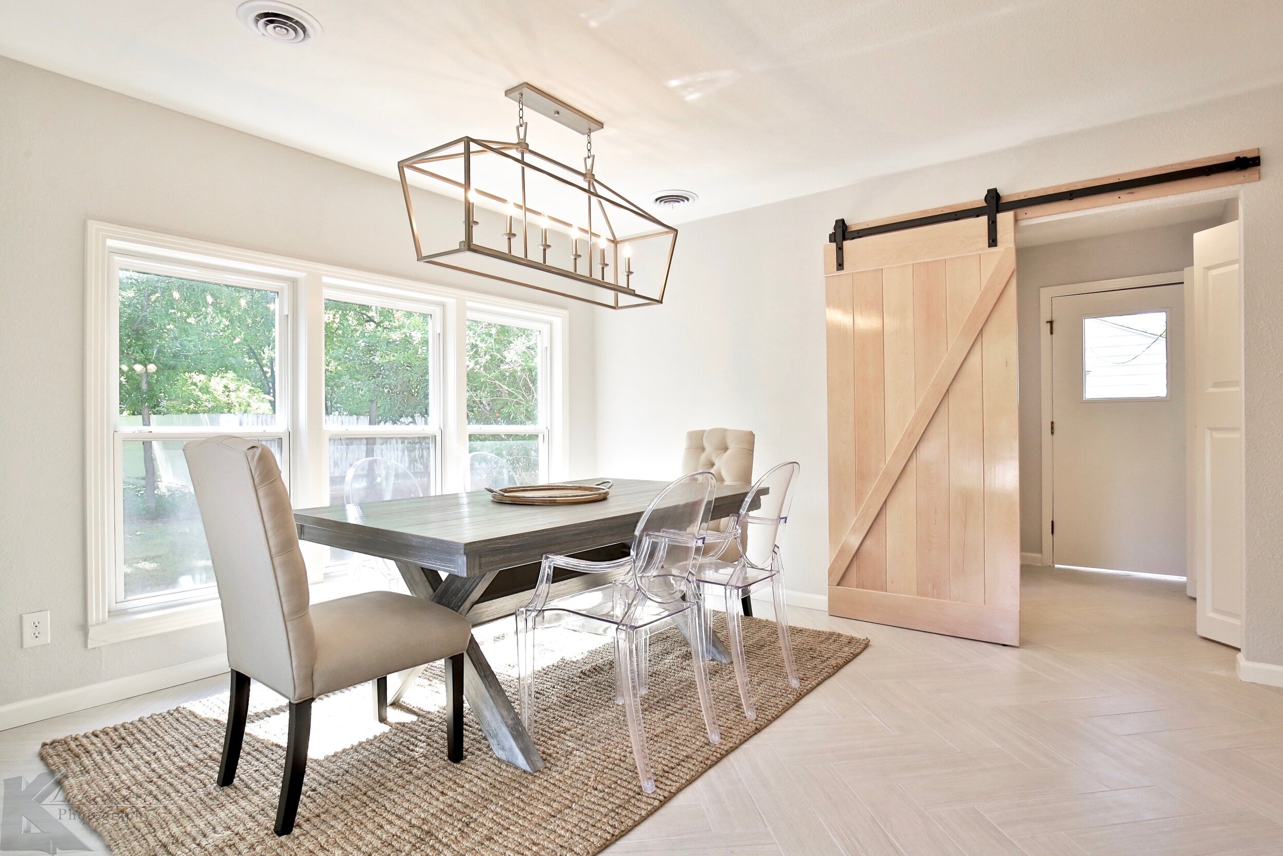
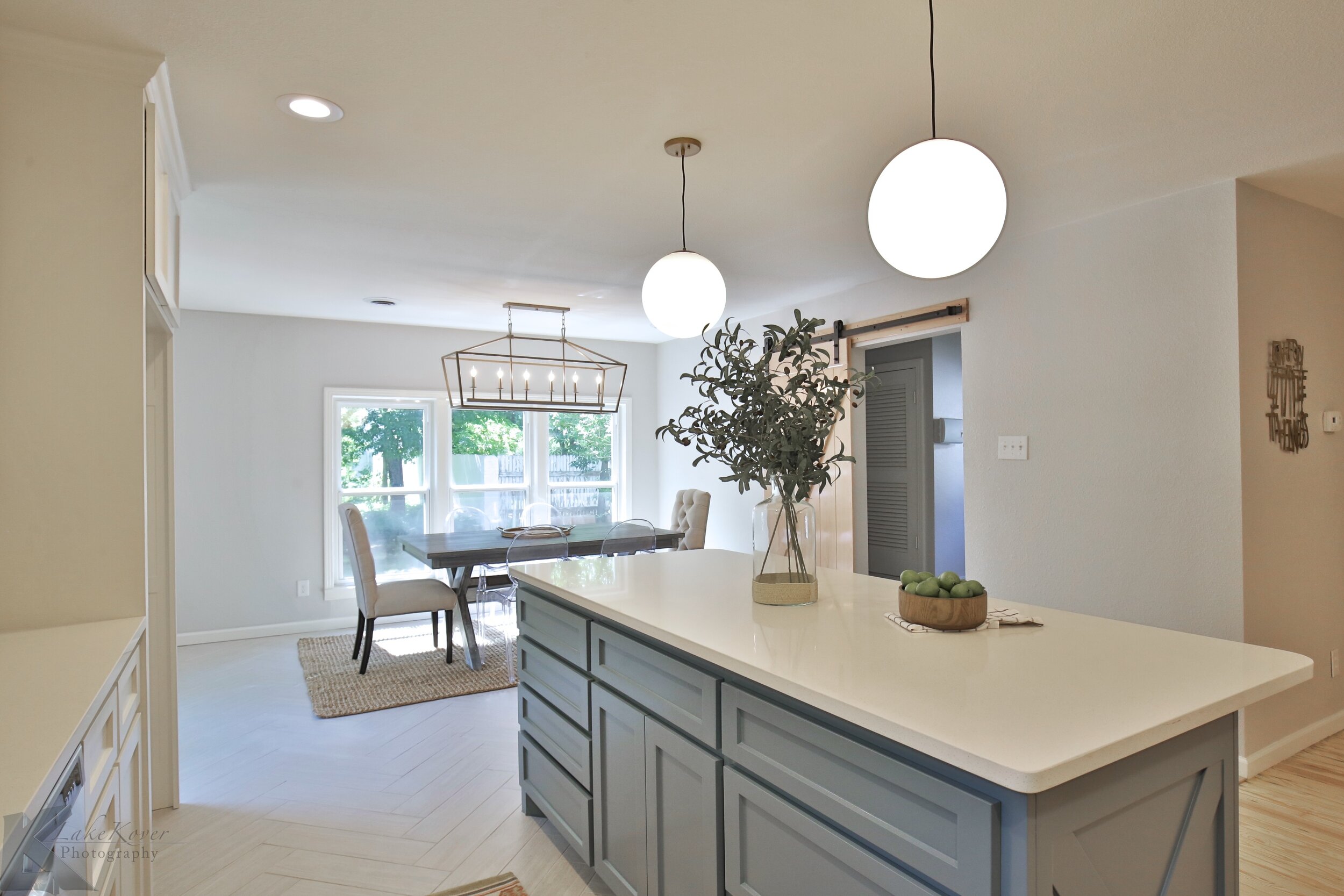
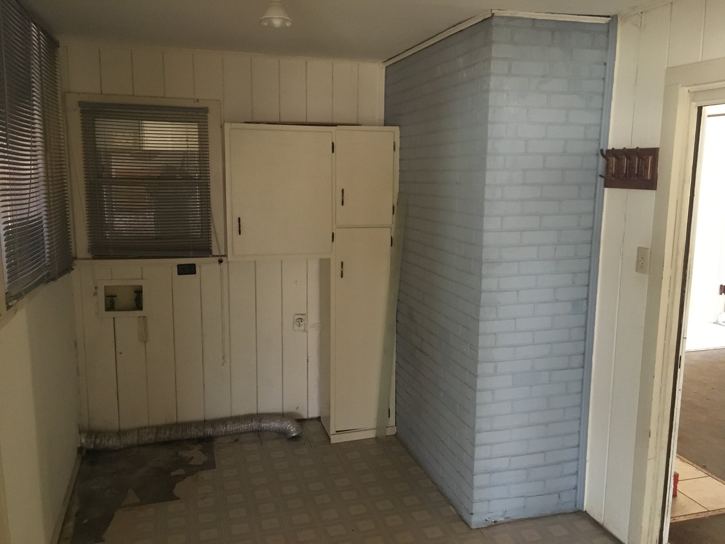
This kitchen was tiny and had a faux brick wall that really closed off the space. Taking out the wall opened up the kitchen to flow into the living and dining room better. We designed an enclosed refrigerator cabinet to utilize the room around the refrigerator for storage from the ceiling to the floor.

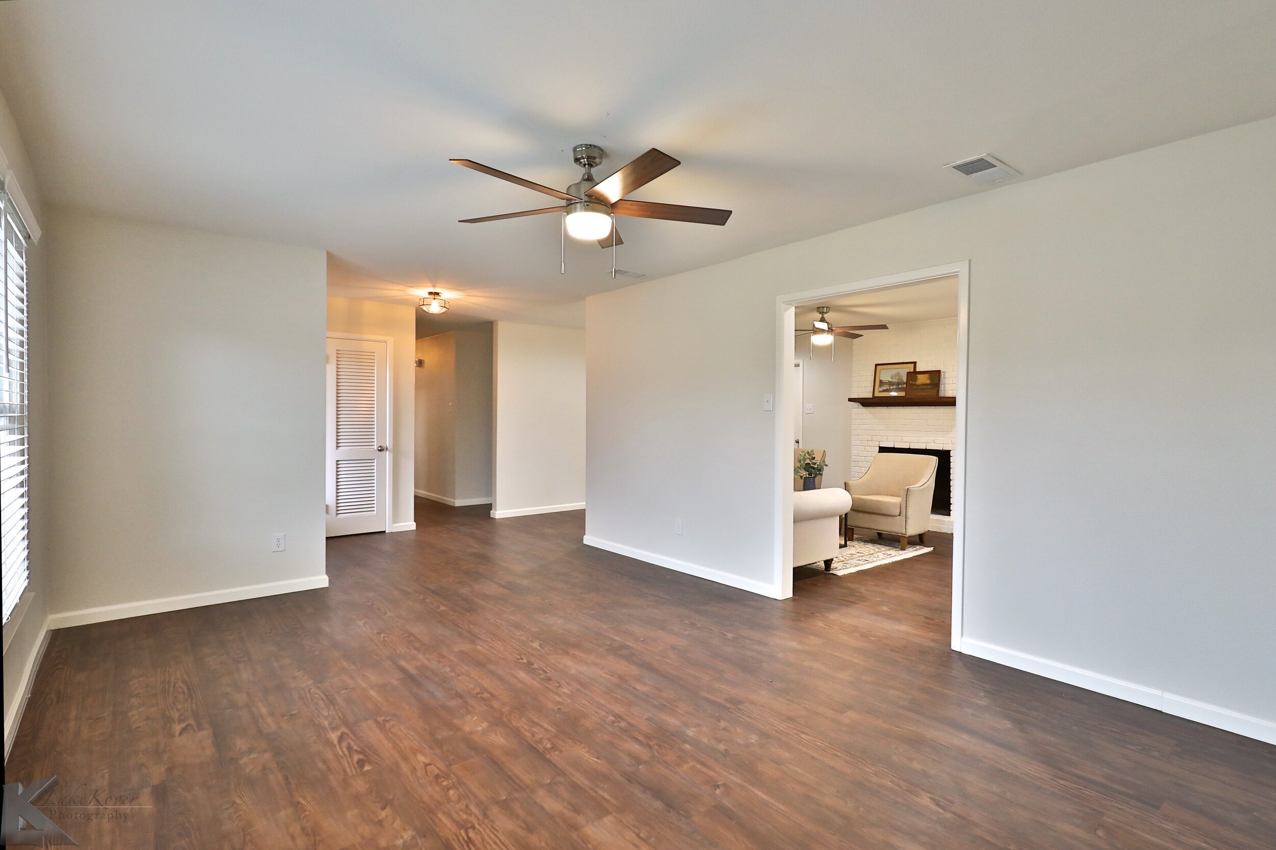
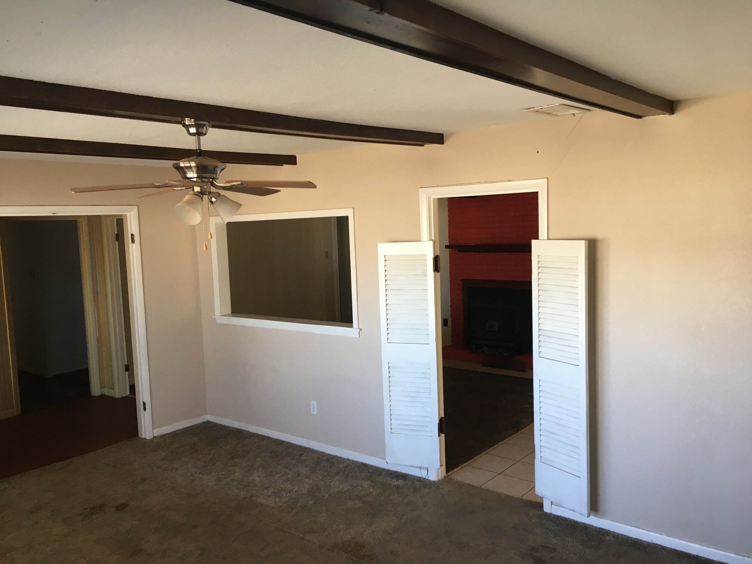
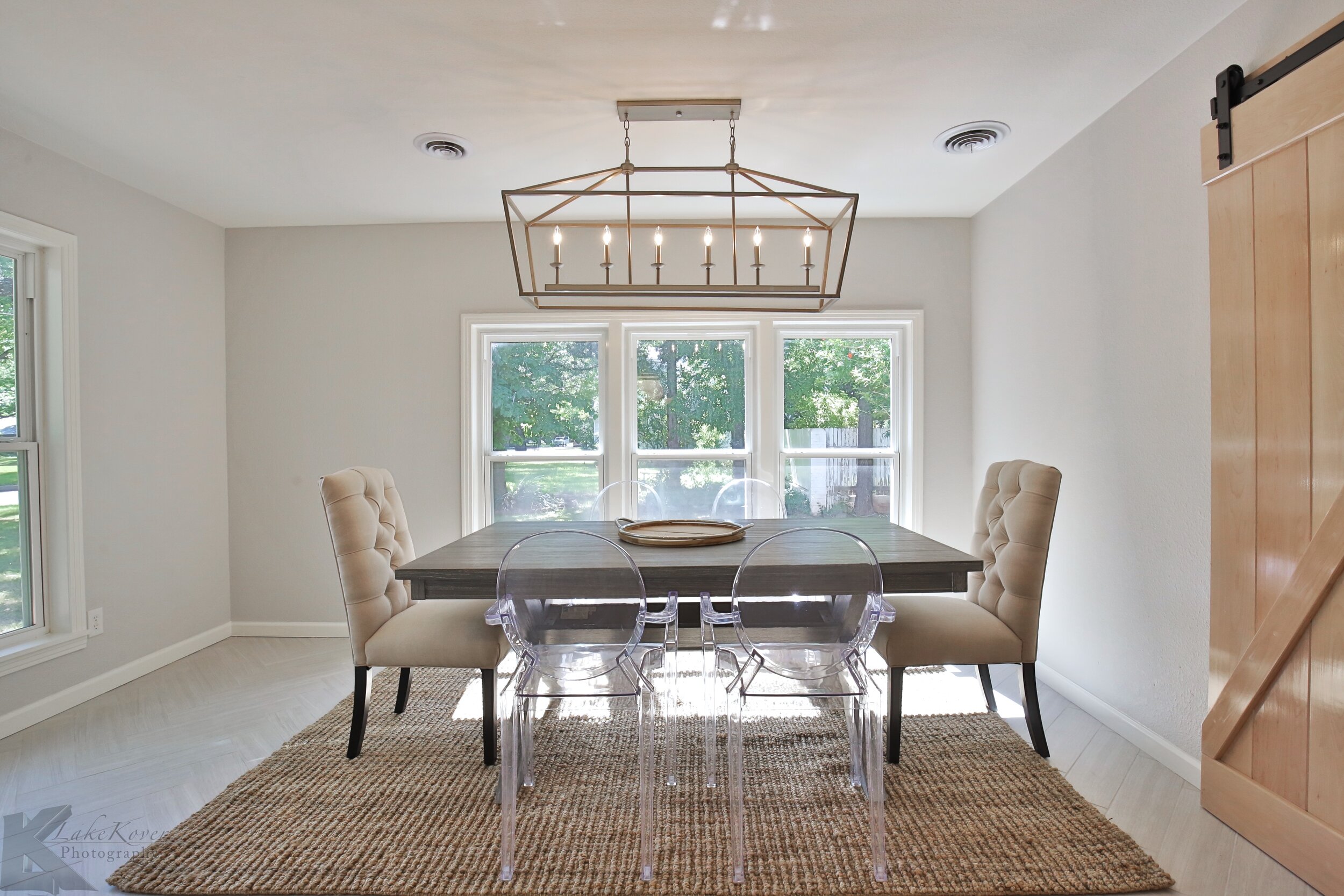
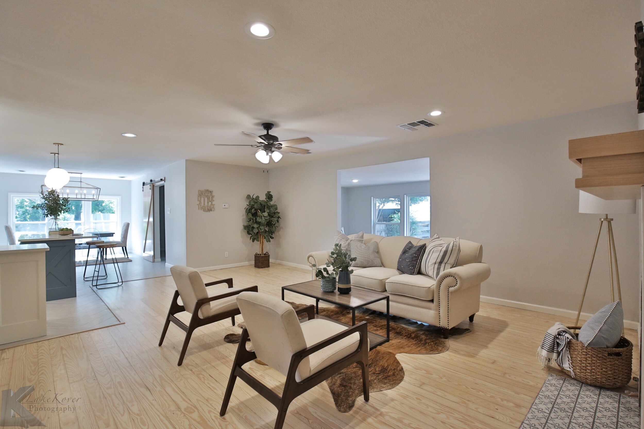
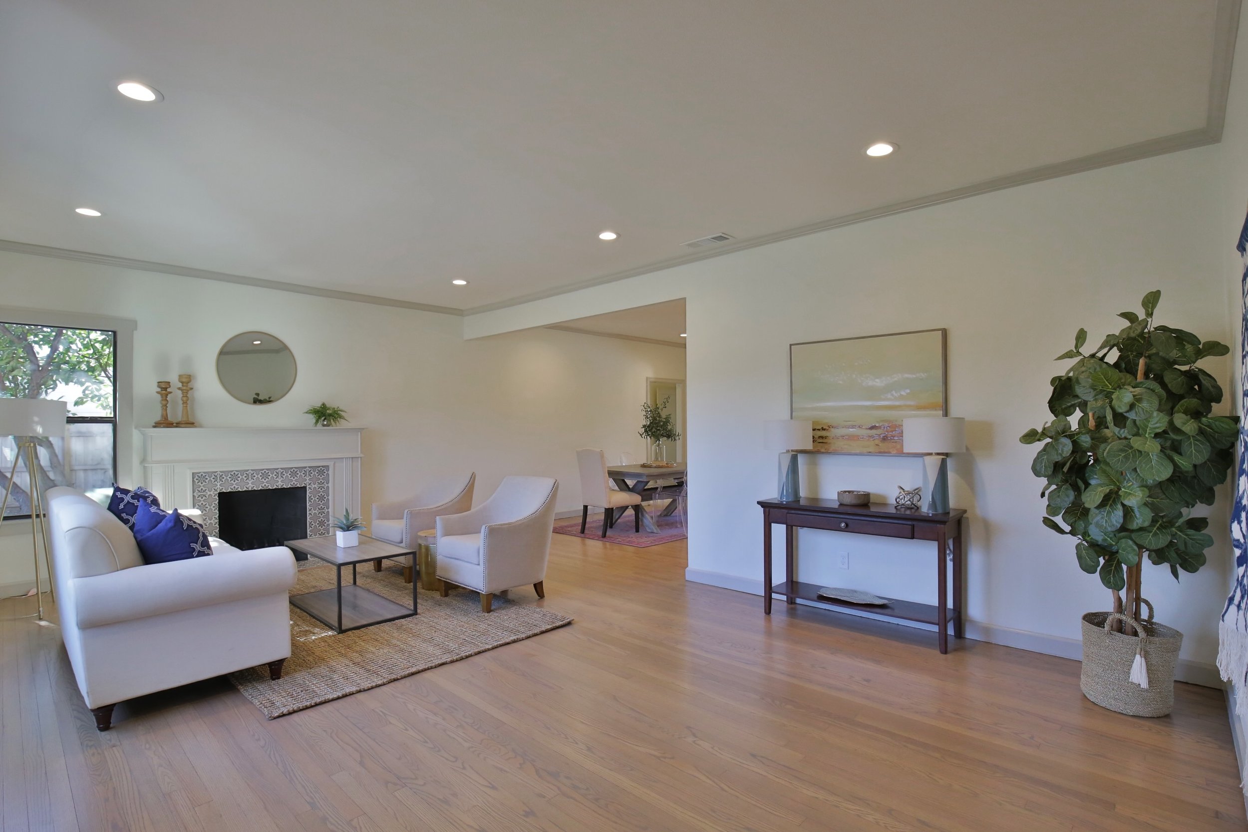
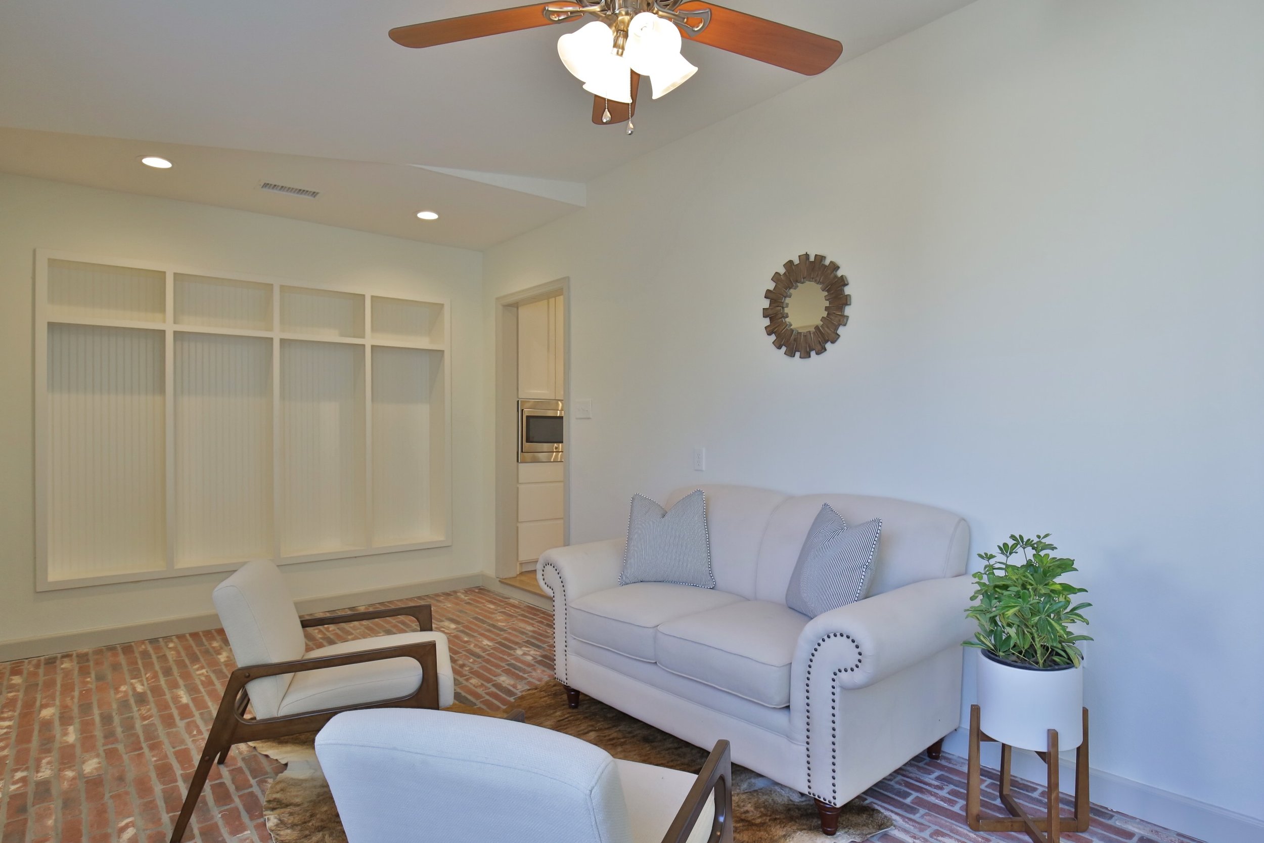
The front room was really awkward with the swinging saloon type doors and random pass through window. We opened up the door ways leading into this room, the living room and the hallway so the sheetrock was flush with the ceiling. Maybe something that doesn’t seem like it would be a big deal but I think it goes a long way in making the house feel cohesive.

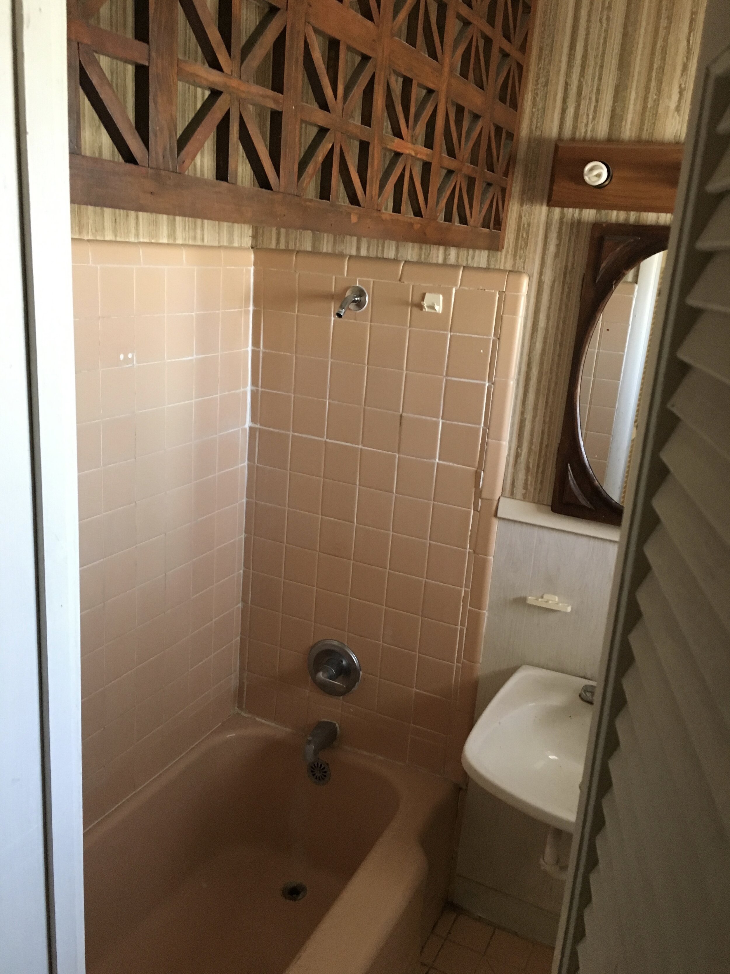
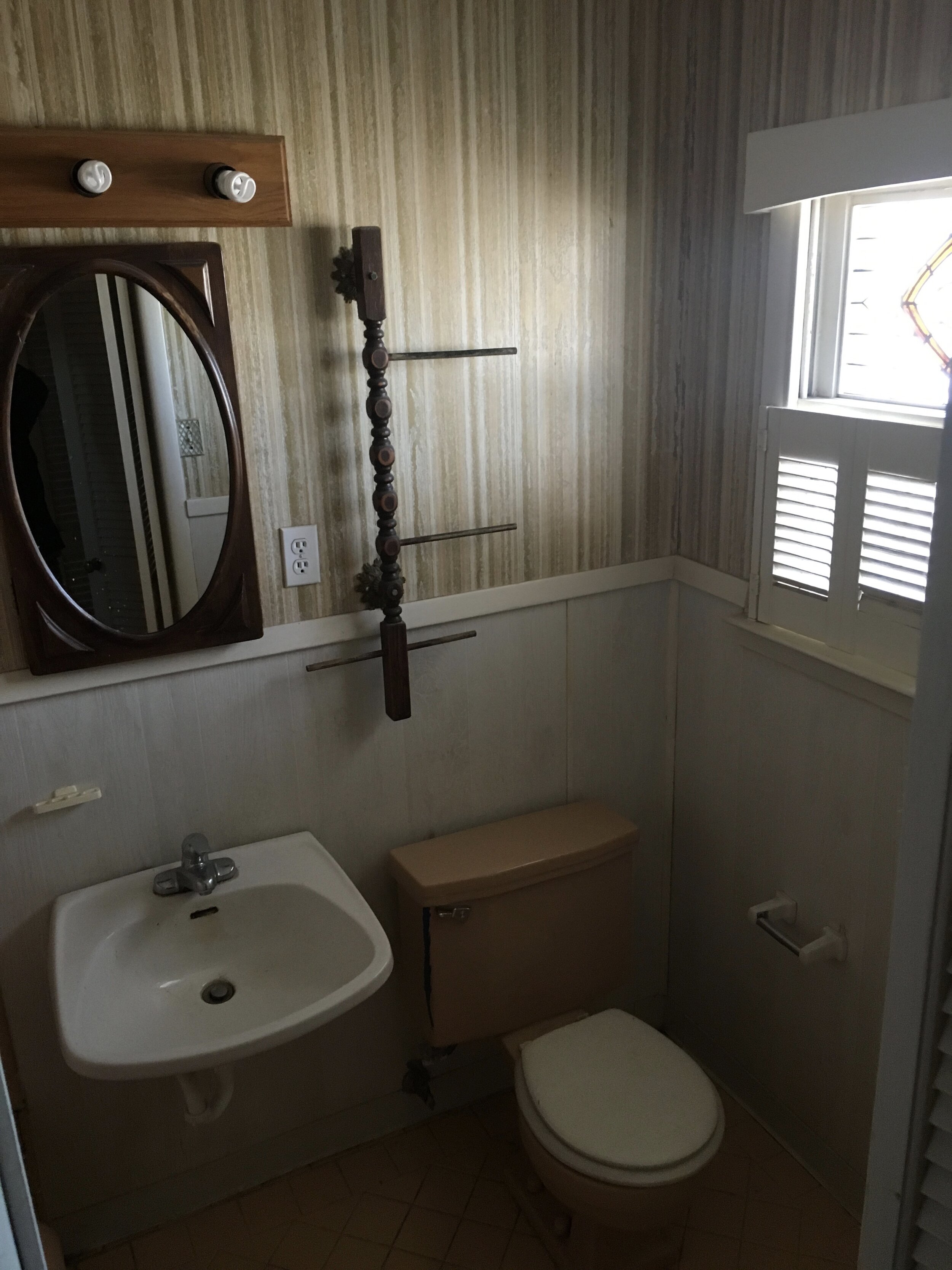
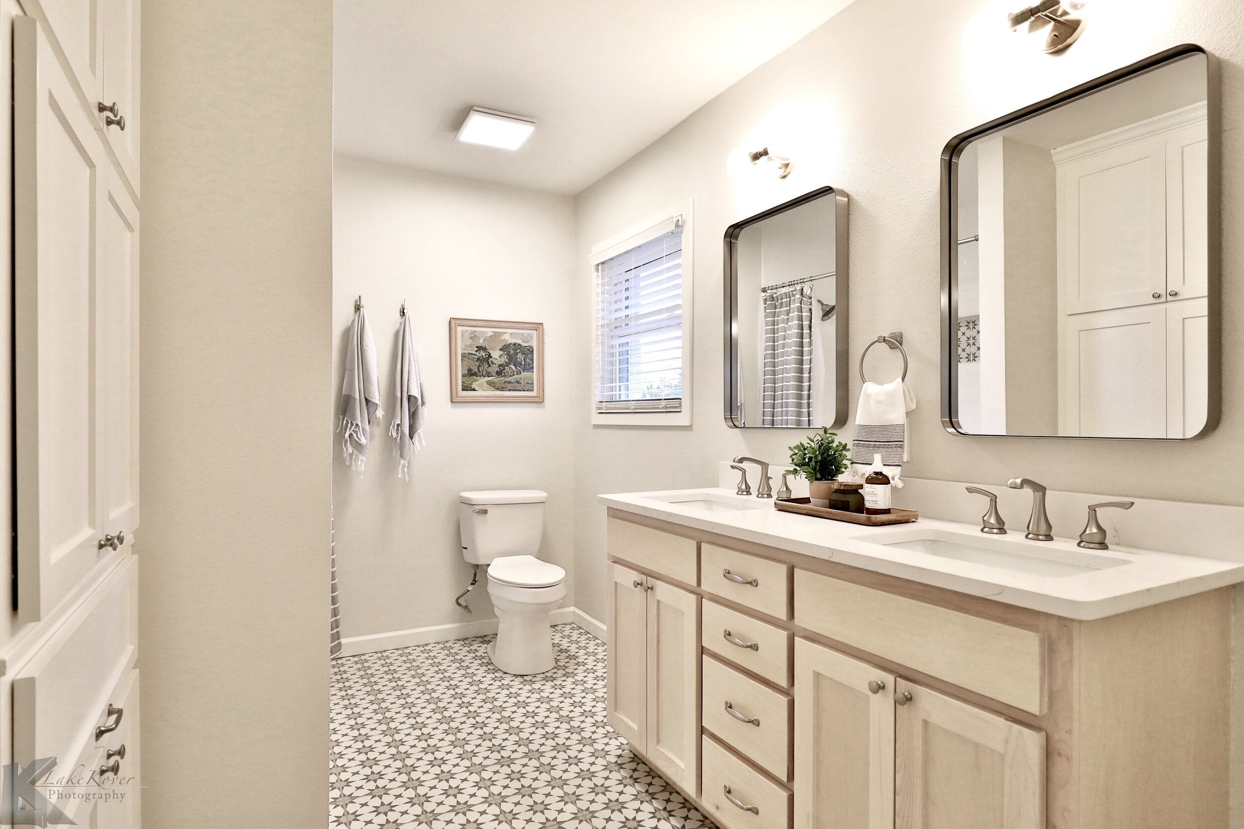
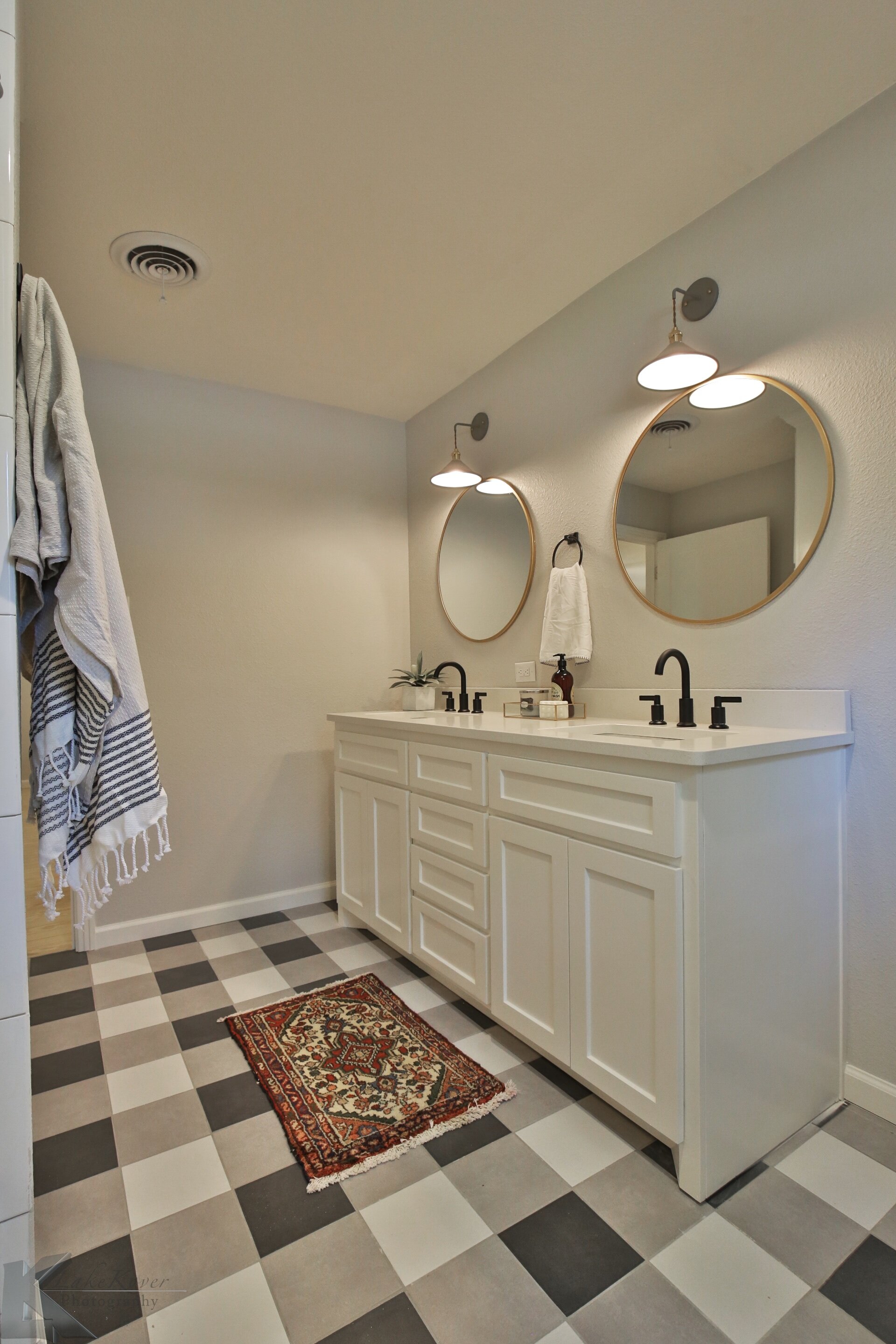
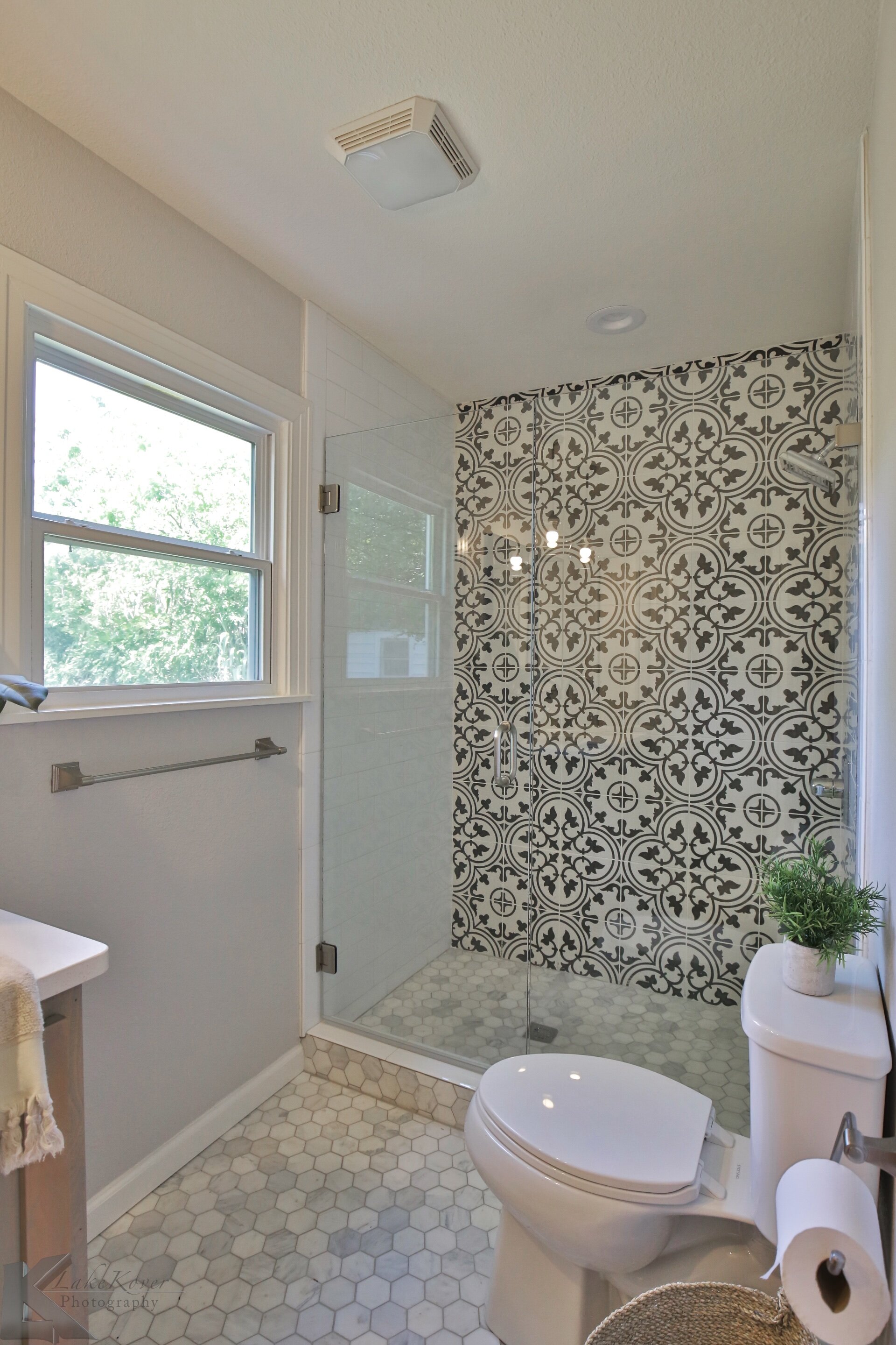
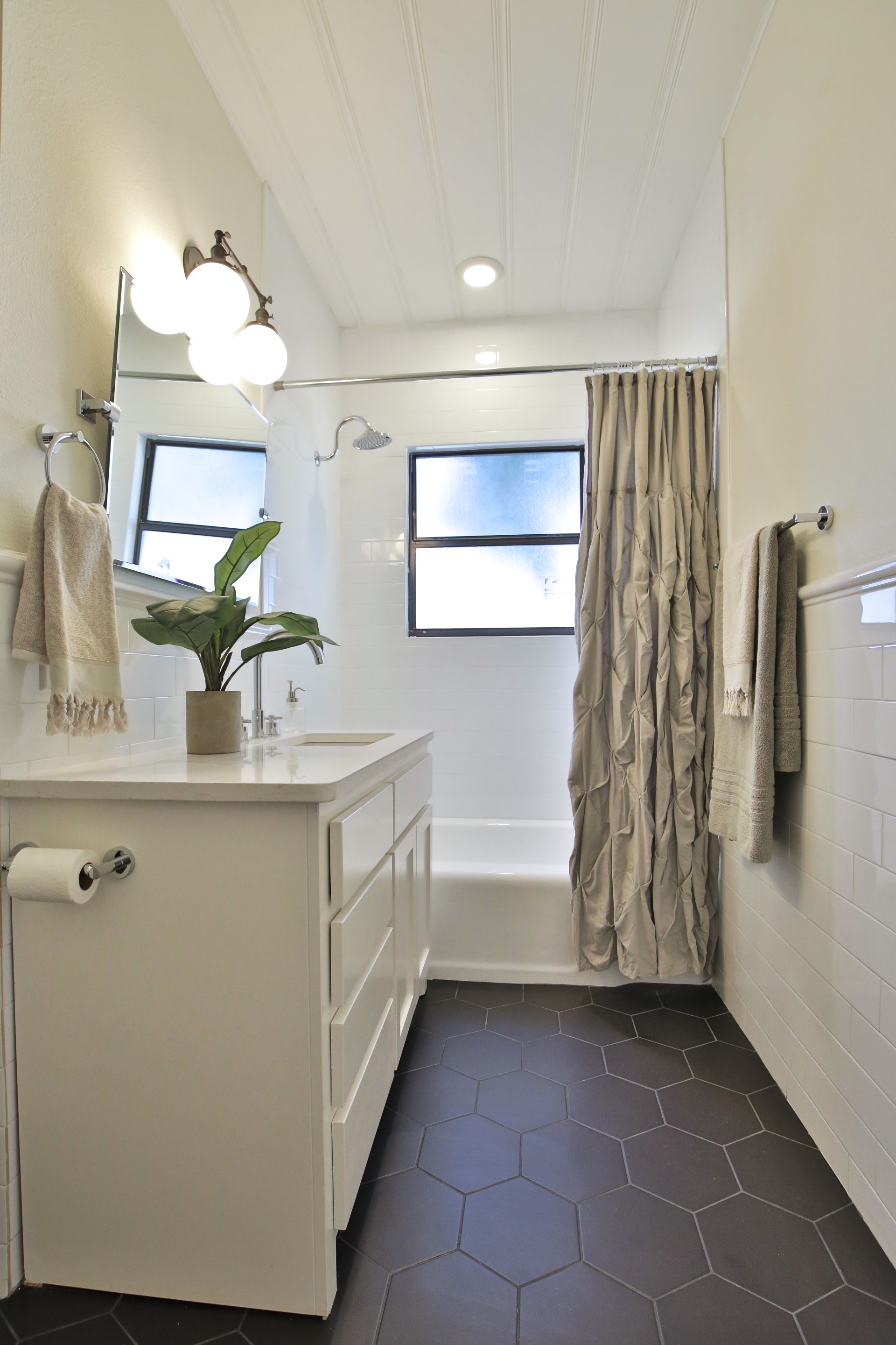
A ton of work was put into the master bathroom with the layout and design! Like the rest of the house it was weird spaces, chopped up, and felt confusing. The master bedroom already had two large closets so we didn’t feel too bad taking out one of the closets to add room for a double sink vanity. We used beech wood on the vanity and very light stain.

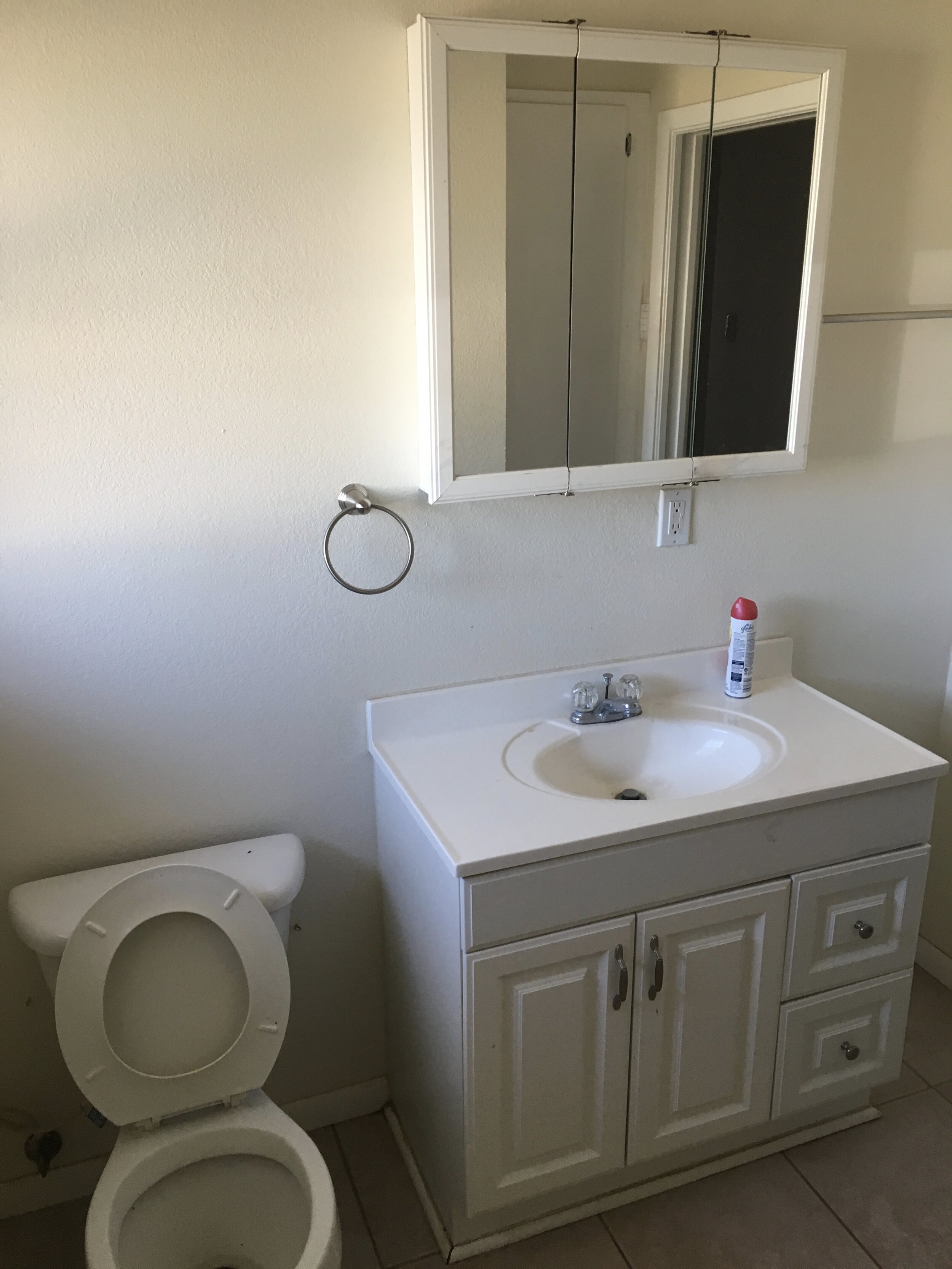
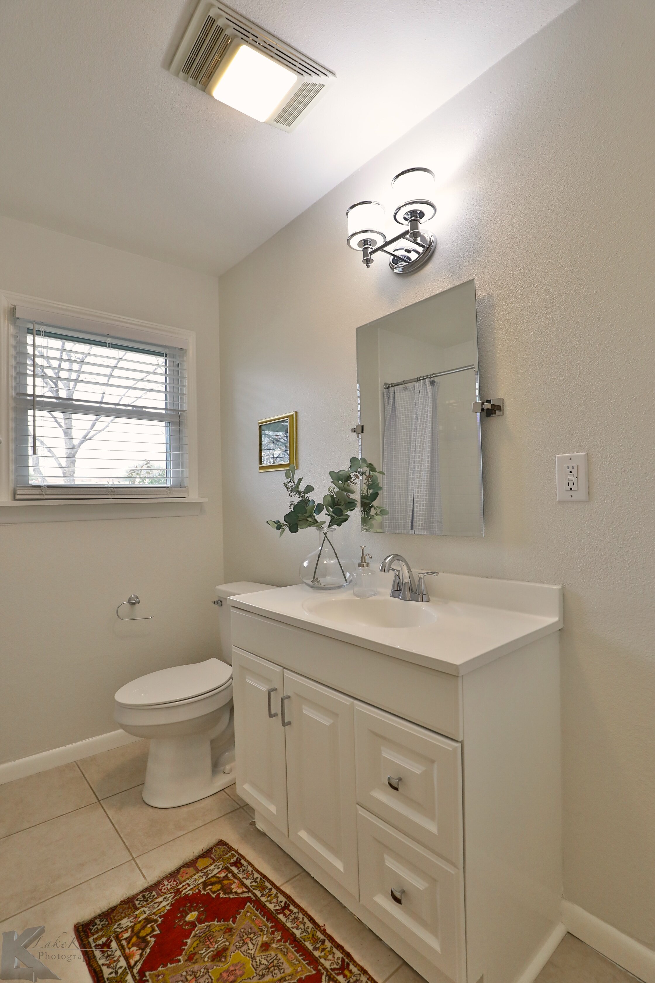
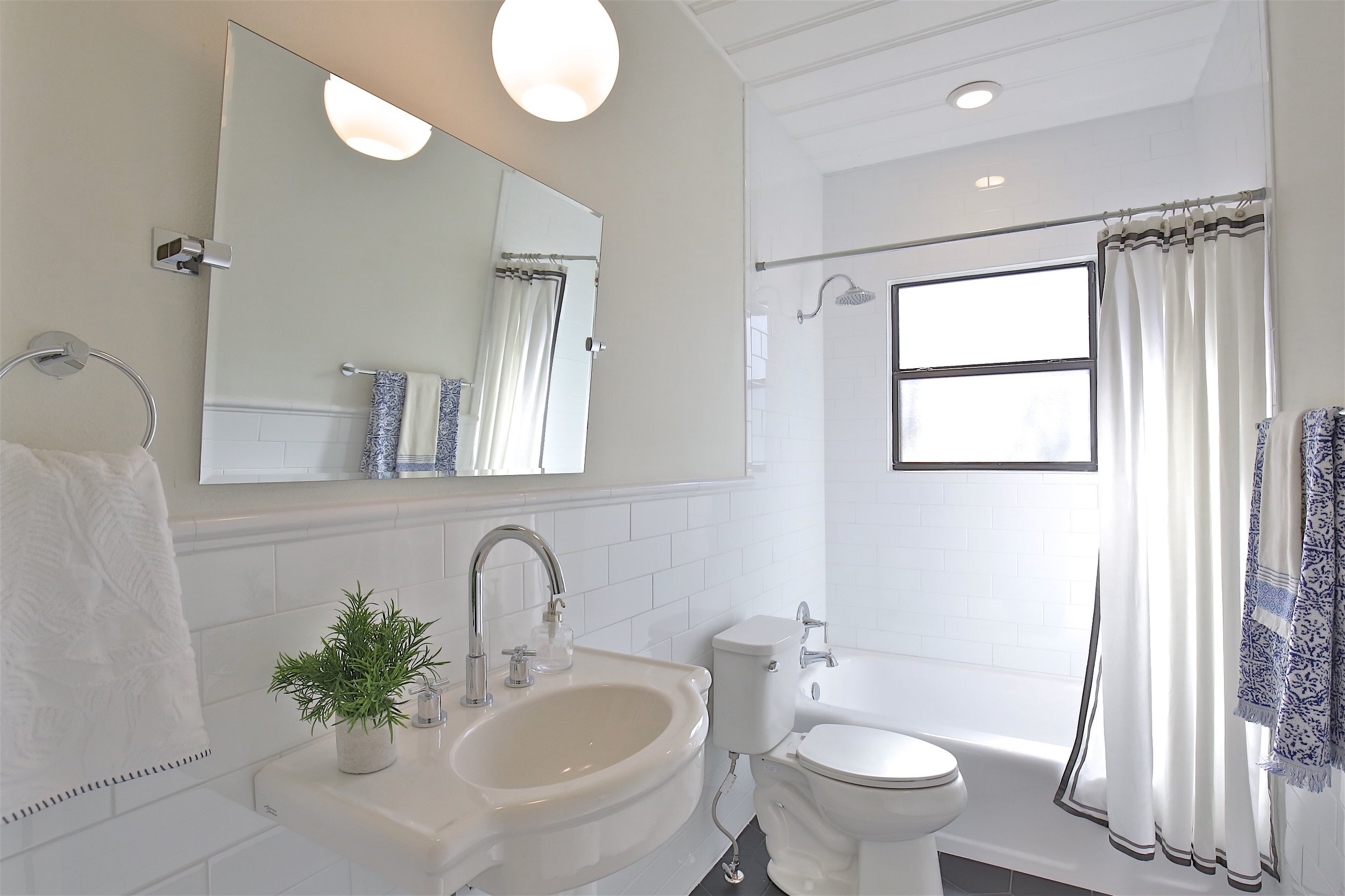
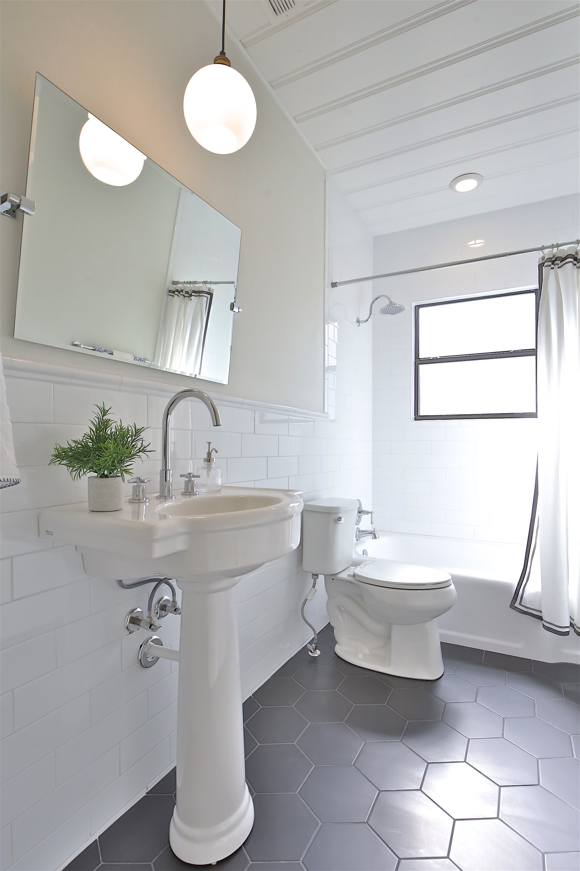
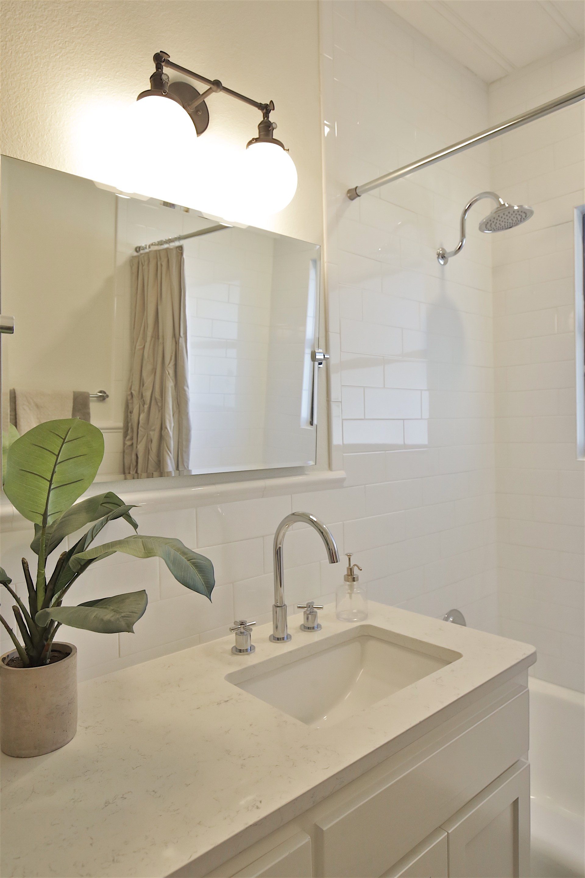
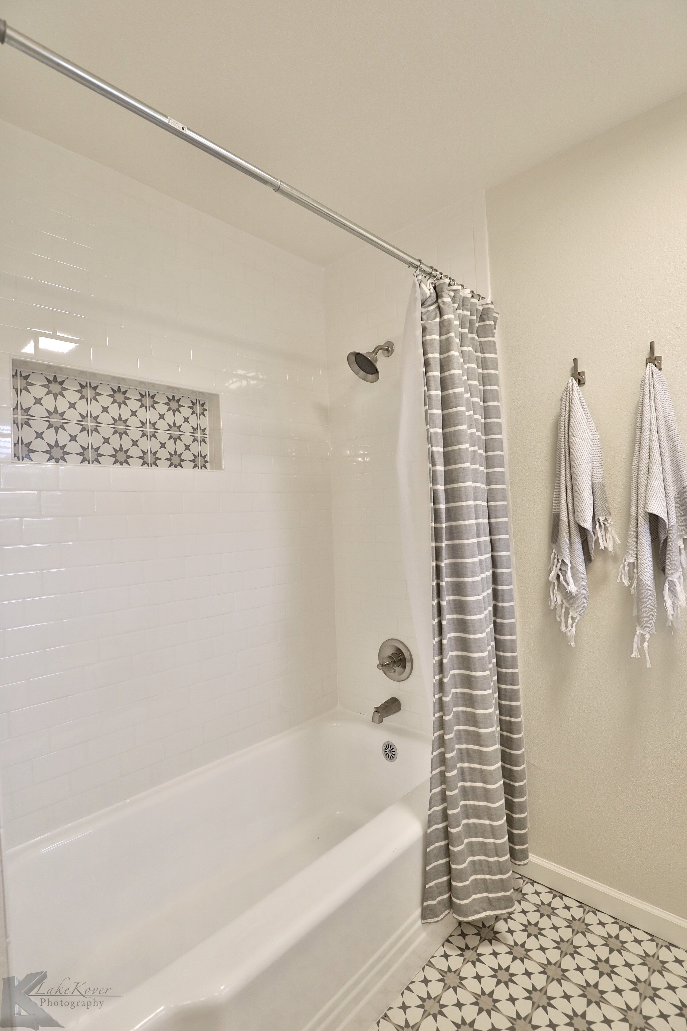
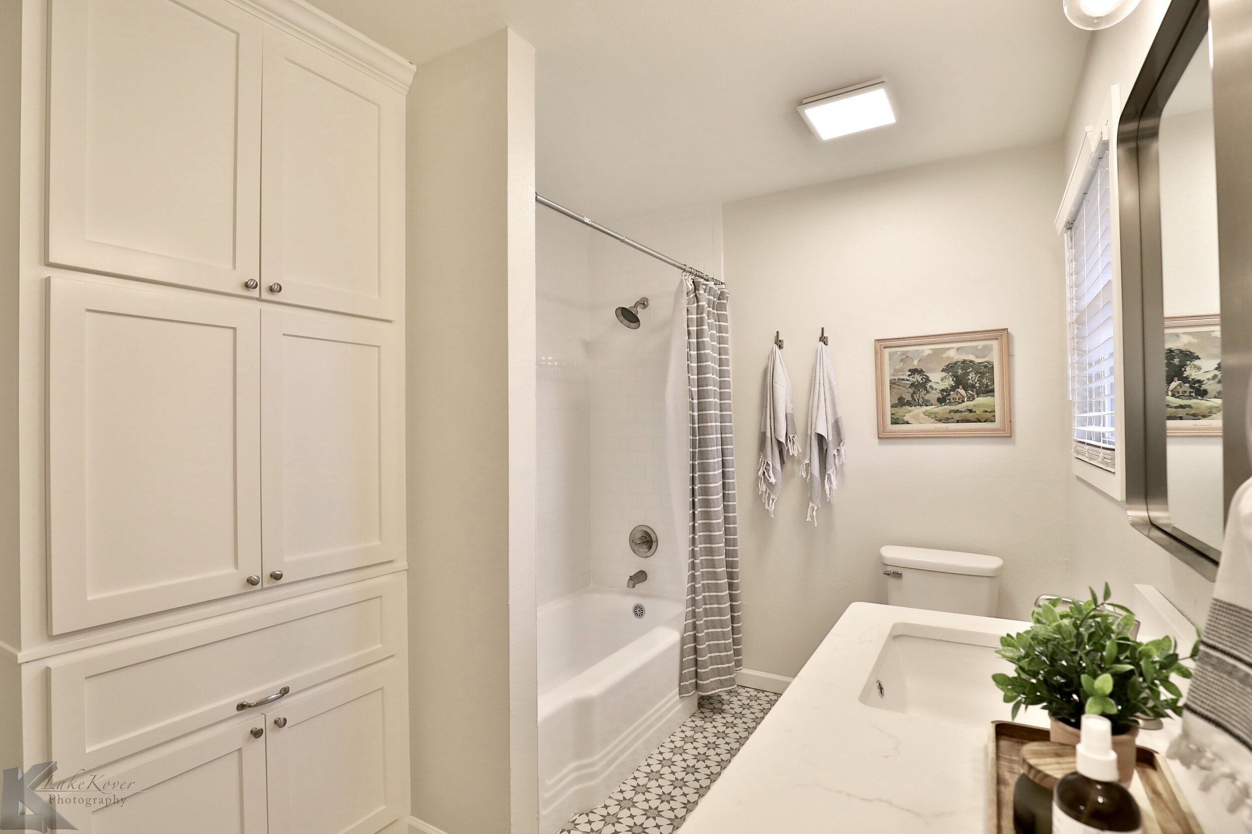
The hall bath cleaned up nicely with some new fixtures and paint.

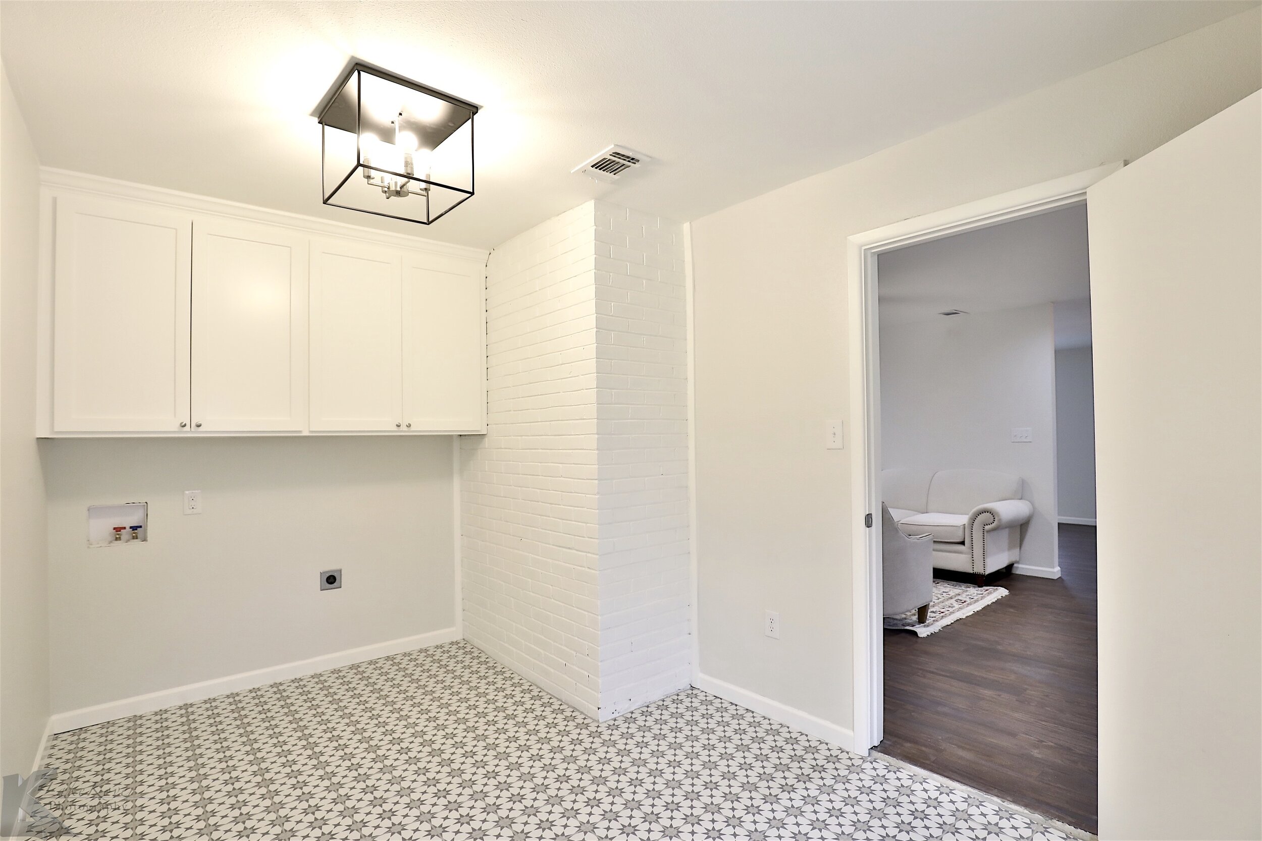
As much as it would have been nice to keep this vertical shiplap it would have been too hard to patch with all the odd windows and doors we needed to close in. We love adding a pop in smaller spaces and this tile was perfect for the laundry room. Its a porcelain tile from Home Depot that looks like the super popular cement tile but the new owners wont have to deal with the upkeep of real cement tile!

9U6A7534.jpeg

Reaching the finish line on this project felt really nice! It turned out to be something we are proud of and it wasn’t the ugly house on the block anymore!

ward before + afters

IMG_4259.jpg

Looking back through these pictures to start this post was so fun! We actually finished this project over a year ago, but with so many new projects in the works I wanted to get the blog caught up. We love looking at before + after pictures so hopefully these are entertaining to someone else too! We were so excited to get our hands on this project. .


The house was situated on a beautiful lot in an adorable neighborhood. As the house itself was a little boring, our objective was to give the exterior some character. We wanted to do justice to the neighborhood, as well as the home. We pulled out the porch to add a sitting area and also give the house some dimension. The shutters painted white gave the house another layer of design without taking away from the new porch. I love how this came together!


In the kitchen and dining space we opened up a couple walls into the living area and we also added a wall to close off the laundry area Its hard to see here, but we added a grey tile in a herringbone pattern throughout the kitchen!


Both pictures are taken from the same spot! This really shows the walls that were knocked out to create this beautiful open concept space.


The living area had a door that closed off the hallway, opening up that door and making the sheetrock flush to the ceiling made the space look so much bigger. On the other side of the room is a step down into an enclosed porch. As much as it let in beautiful light, we thought defining these spaces and closing up the walls was going to be more appealing. And the holy grail in house flipping: finding these hardwoods under carpet!


This hall bathroom was a little odd. It snaked around with a small vanity, a makeup counter, and a linen closet. It had a lot going on and was totally cramped. Moving the doorway to the other side we were able to create a layout that flowed much better! We used 3 different colors of tile to create this buffalo check look on the floors #hearteyes.


You cant tell from the pictures, but in order to get into the master bathroom you had to walk through a small closet. Again, we took out some walls and reworked the layout in this bathroom. The vanity was also made out of beech wood and we used a natural stain #swoon. We had enough room in the master bedroom to build out a new closet so it was a win win.


What a fun project! We are thankful to have the opportunity to work in such a beautiful neighborhood!

12th & grand before + afters

IMG_2161.jpg

Can I get a huge sold sticker to put over this because this darling home went off to be with its new family! And I have a good feelings its going to be well loved, as much as we did and more. We had so much fun with this project and couldn't be happier with how it turned out. Its truly a very special house and in such a great neighborhood. As the design came together and life was brought back into the house that had been vacant for a while, we adored it even more. Let's get to the good stuff, the before + afters. 


This house sat on a large corner lot in the heart of our town, but you couldn't see it! The landscaping had overgrown so much the house was completely covered. Thankfully, we have Jon! And Jon has such a good eye for what trees and shrub can stay, go, be trimmed up, etc. He worked on the landscaping throughout the whole project, which mainly consisted of trimming and stump grinding. We painted the exterior Swiss Coffee by Benjamin Moore, added wood shutters, new roof, new windows, and fun house numbers! The three boxwoods and cypress were the only plants added.


In the living space we had B E A U T I F U L hardwood floors! We were determined to keep them which took a lot of patching and sanding to bring out their glory, but I'd say it was worth it! We used a combination of white and brown stain that produced a natural wood look color. I LOVE how they turned out! We opened up the space between the living and dining room to have more of an open concept feel, but left the wall up between the kitchen and living area. Open concept is great, but its nice to have some separation in rooms. We painted the walls Swiss Coffee by Benjamin Moore and the trim Revere Pewter by Benjamin Moore. 


The only thing we changed here was the tile and paint! Such an easy update for any house and packs a huge punch. Now the fireplace is a statement piece for this living room and I'm obsessed with this tile! We also used it on the backsplash in the kitchen and really tied those two spaces together. The tile is Merola brand that Home Depot carries and I love it! Its actually a porcelain tile that looks like cement, win win in my book! The paint color is Revere Pewter by Benjamin Moore. 


Opening up these walls really made the house flow much better and makes the space look so much bigger! After a little bit of patching we were able to keep the hardwoods throughout the kitchen *drool*. I think having hardwoods in the kitchen really warms up the space, it felt so home(y) when you were in it! I can imagine the fun meals and dinners that are going to be held in here!


Custom cabinets, quartz countertops, farmhouse sink, I mean, this kitchen is a D R E A M! Throughout the whole house we wanted to keep the character of the era this house was built, but with a modern play on the finish out pieces. On the cabinets we added smaller doors on the upper cabinets, which was a poplar design in the 1940's. The cabinets are painted Acoustic White by Kelly Moore. 


As much as I wanted to go back with all pedastool sinks, we needed storage! So we compromised having one bathroom with a large vanity and the other bathroom with a pedastool sink. You can't see it very well in this picture, but the pendant vanity light has a black and gold finish on it, but the rest of the fixtures are polished brass. I was initially worried about mixing those finishes, but it turned out perfectly! 


The black hexagon tile floors and large scale subway tile was another play on the older design with a modern twist. Which bathroom is your favorite?


This sun porch and mud room is so fun! We added the brick pavers for more character and I dont think anyone can tell if they are original or not! It's such a timeless look! 


I had to take the opportunity with this garage to add gooseneck lights over each door! The black finish on the goosneck lights provided good contrast and also tied in well with the windows. 


This photo cracks me up!! The landscaping was SO overgrown you cant even see the house, but yes, both of these pictures are taken from the same spot! To say Jon had his hands full here is an understatement, but he kept the good stuff and cut out the junk. The walls around the porch had cedar shake on them which was cute, but in really bad condition so we ended up having to remove all of it. This patio area and backyard is so cute!   


We hope y'all love it! When I look at this house I see many months of hard work and a beautiful outcome. For the surrounding community it adds value to each of their homes, as well. We feel so blessed with each house to have the opportunity to work on them and make them better then new! 

We've Got A New Website Ya'll!

Hello!

Welcome to our online home where we get to take you behind the scenes with JGN Propeties! We are so excited about our new website designed by A People Party Productions. Yay!

We hope you will join us as we update you on our latest projects here on the JGN Blog! Feel free to share and comment.

Below is our latest project we just completed on Grand Ave.This 4 bed 2 bath home has been beautifully updated with modern amenities while still preserving all the charm and character! The kitchen boast custom cabinets with gorgeous quartz counter tops throughout and new stainless steel appliances. The open concept is perfect for hosting friends and family with ease. Bathrooms feature designer finishes! The sun room overlooks a large backyard, and patio area that is ready for entertaining and relaxing! One of a kind home located in the heart of Abilene's Historic Sayles area!

Be sure to scroll the the pics in the link below!

- Niki Grant

9U6A7525.jpeg