12th & grand before + afters
/Can I get a huge sold sticker to put over this because this darling home went off to be with its new family! And I have a good feelings its going to be well loved, as much as we did and more. We had so much fun with this project and couldn't be happier with how it turned out. Its truly a very special house and in such a great neighborhood. As the design came together and life was brought back into the house that had been vacant for a while, we adored it even more. Let's get to the good stuff, the before + afters.
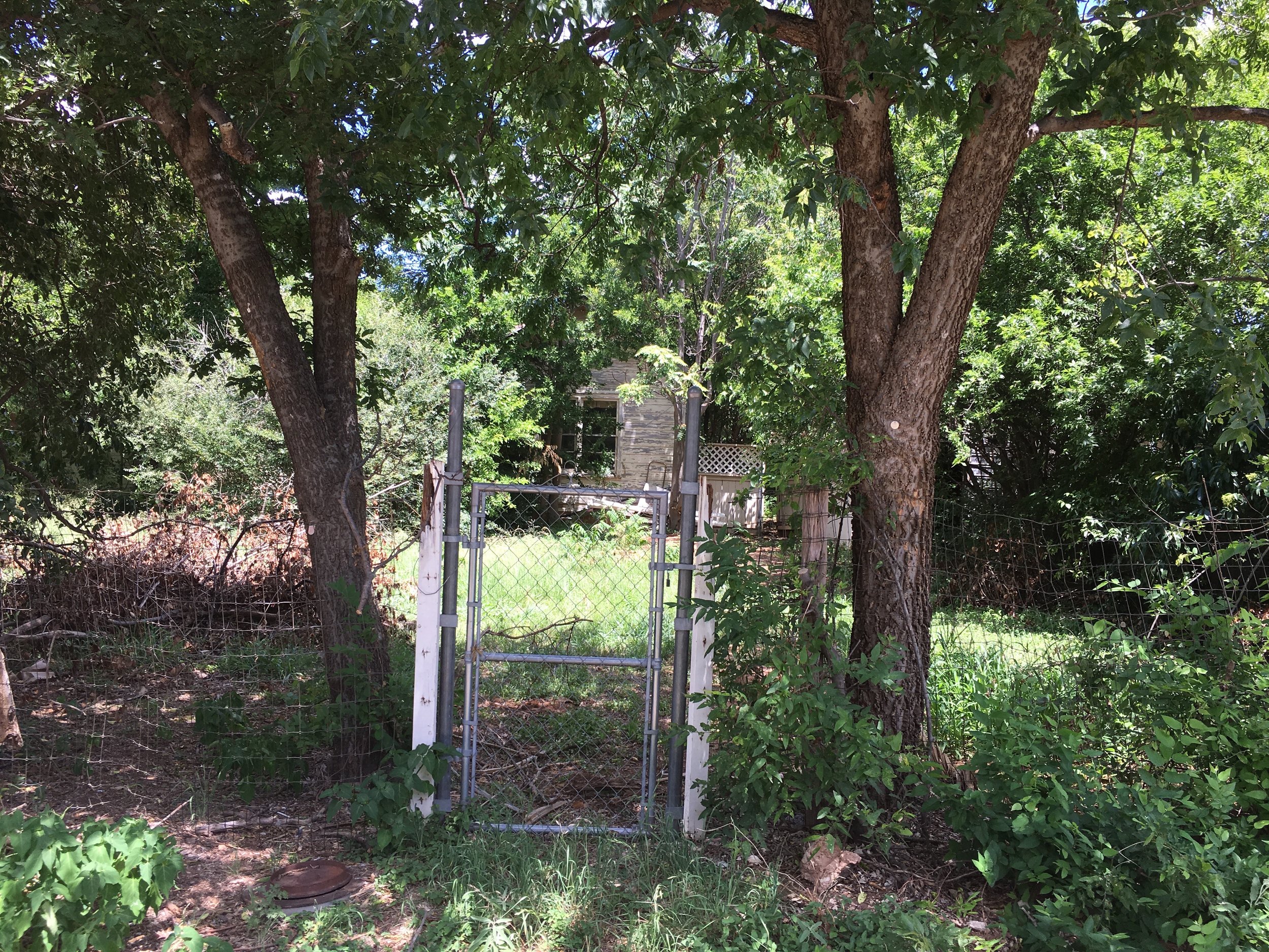
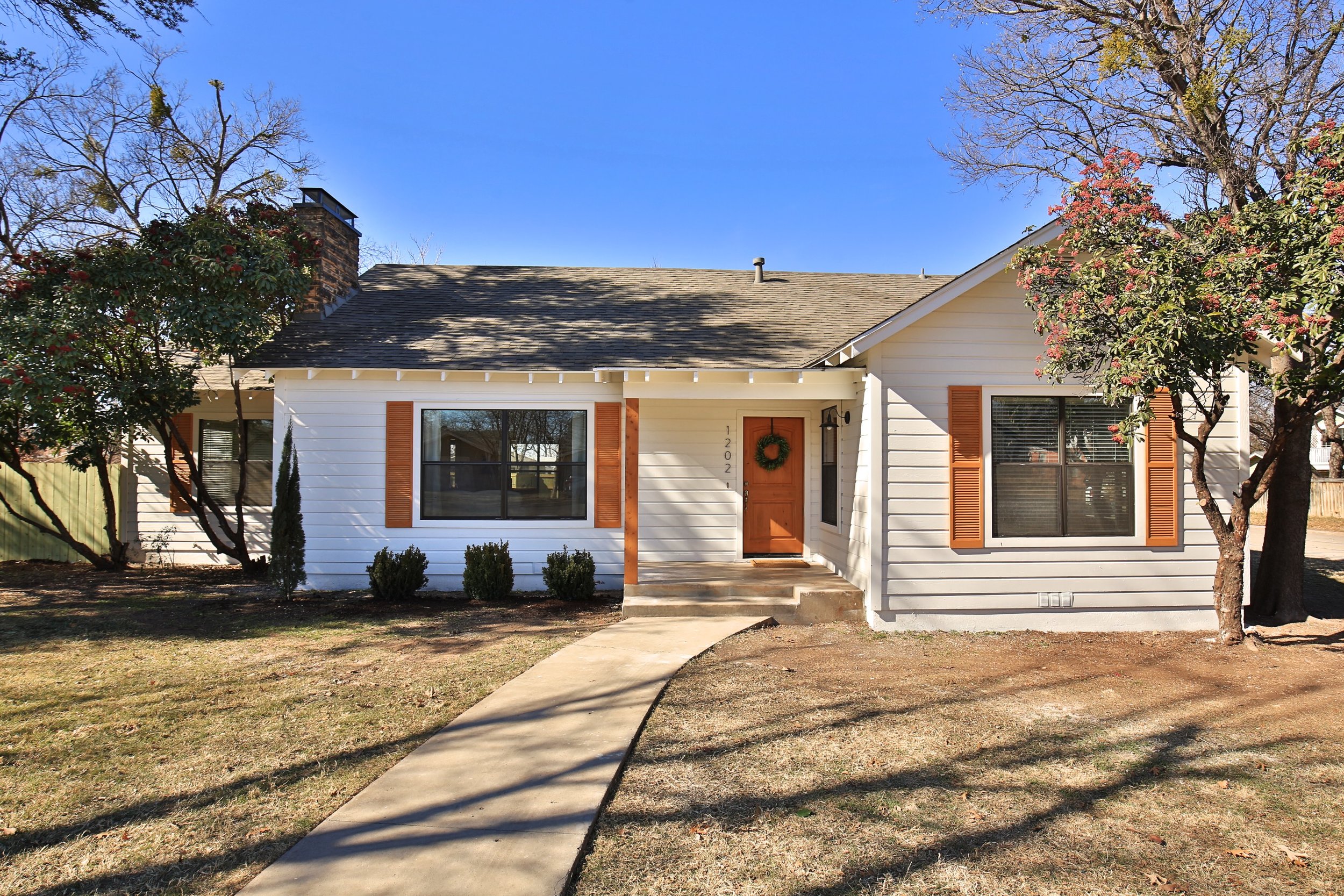
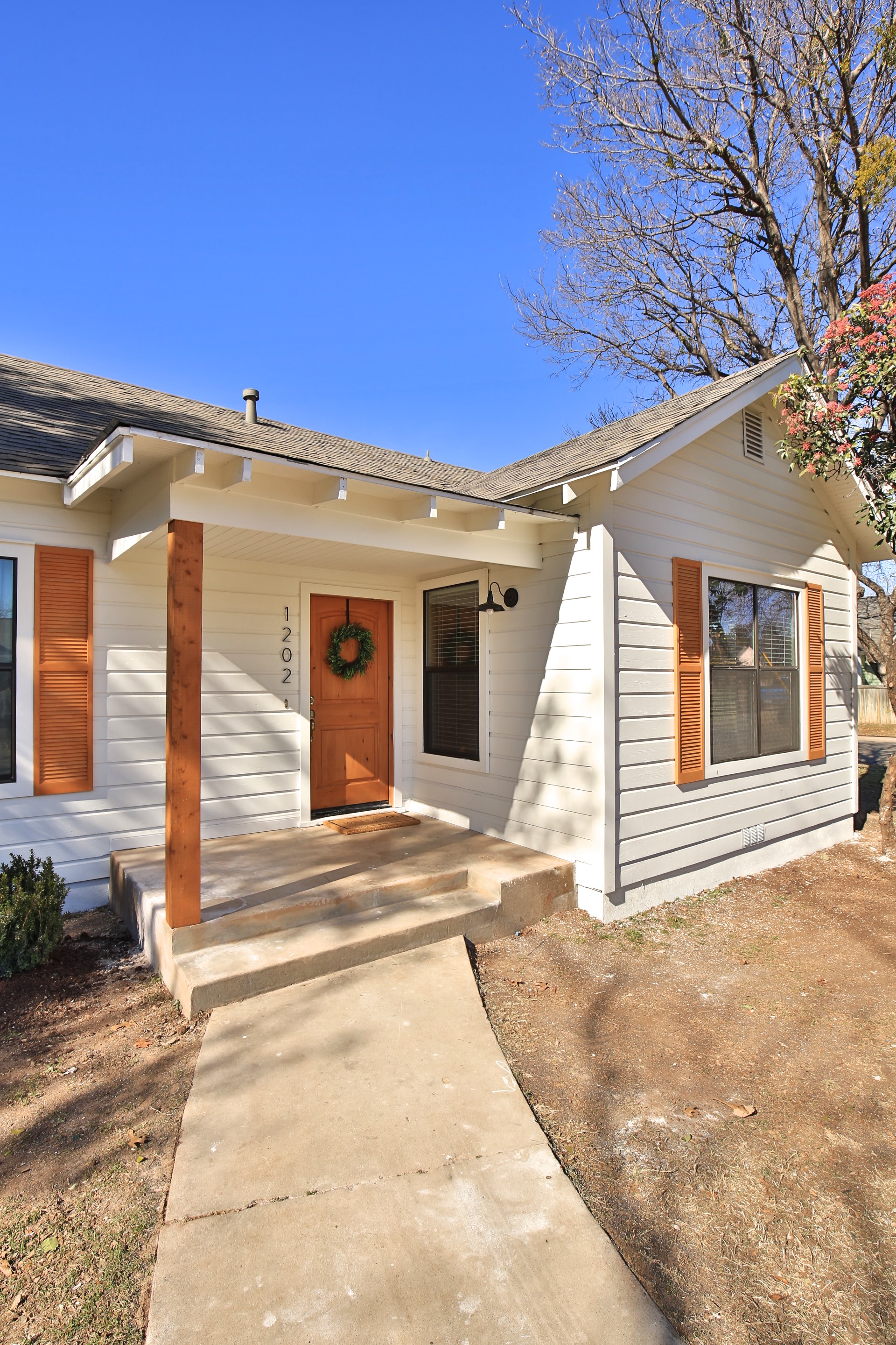
This house sat on a large corner lot in the heart of our town, but you couldn't see it! The landscaping had overgrown so much the house was completely covered. Thankfully, we have Jon! And Jon has such a good eye for what trees and shrub can stay, go, be trimmed up, etc. He worked on the landscaping throughout the whole project, which mainly consisted of trimming and stump grinding. We painted the exterior Swiss Coffee by Benjamin Moore, added wood shutters, new roof, new windows, and fun house numbers! The three boxwoods and cypress were the only plants added.
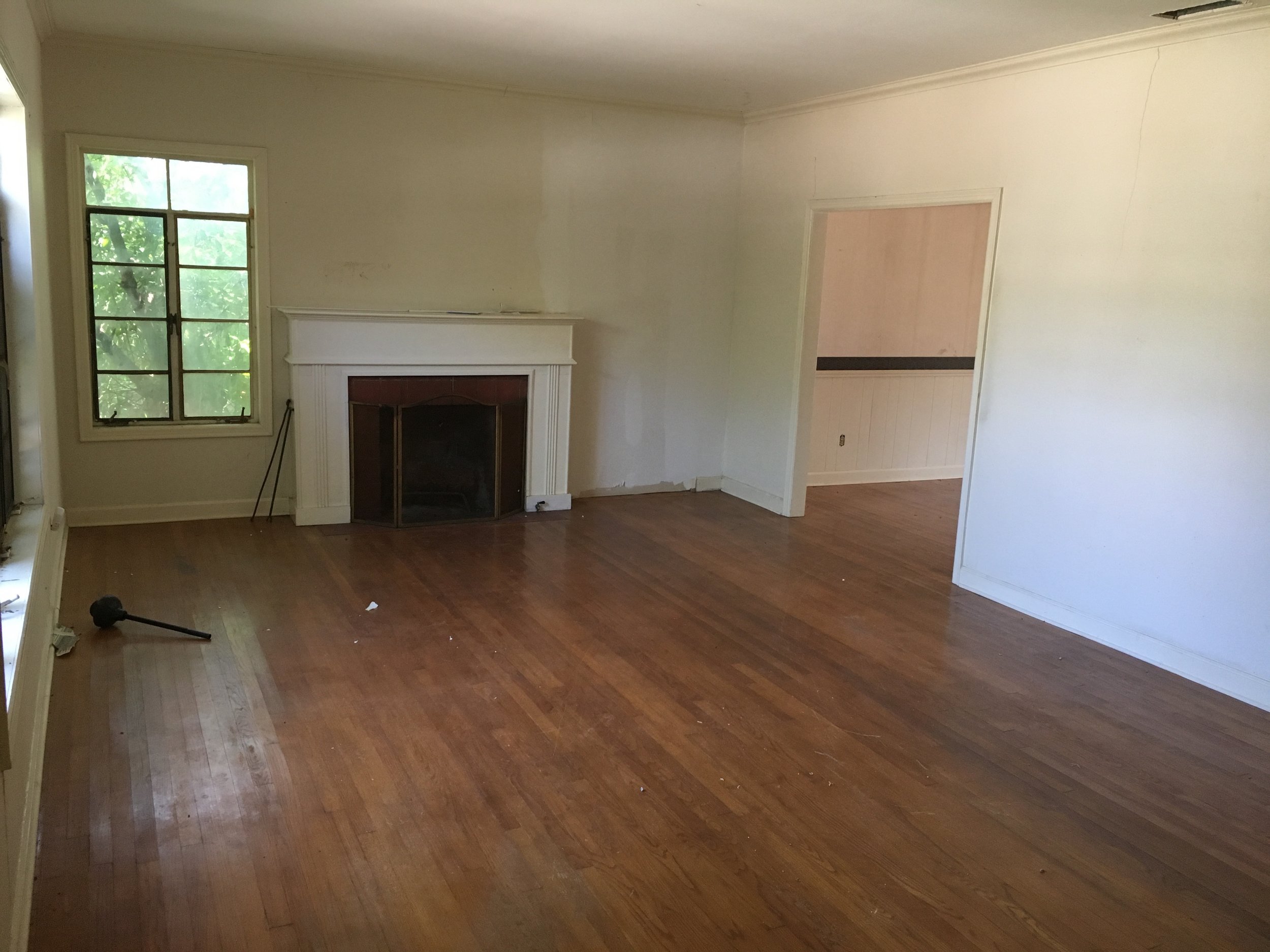
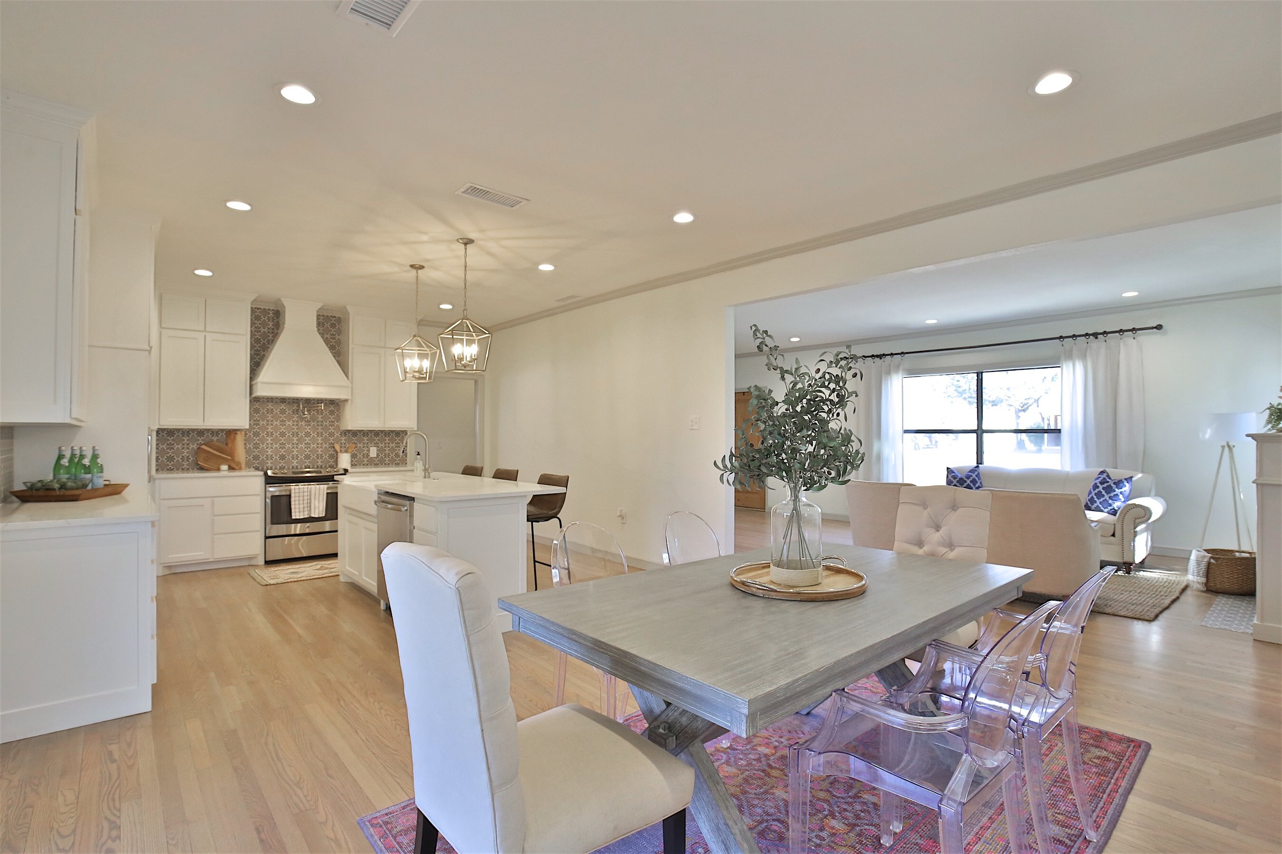
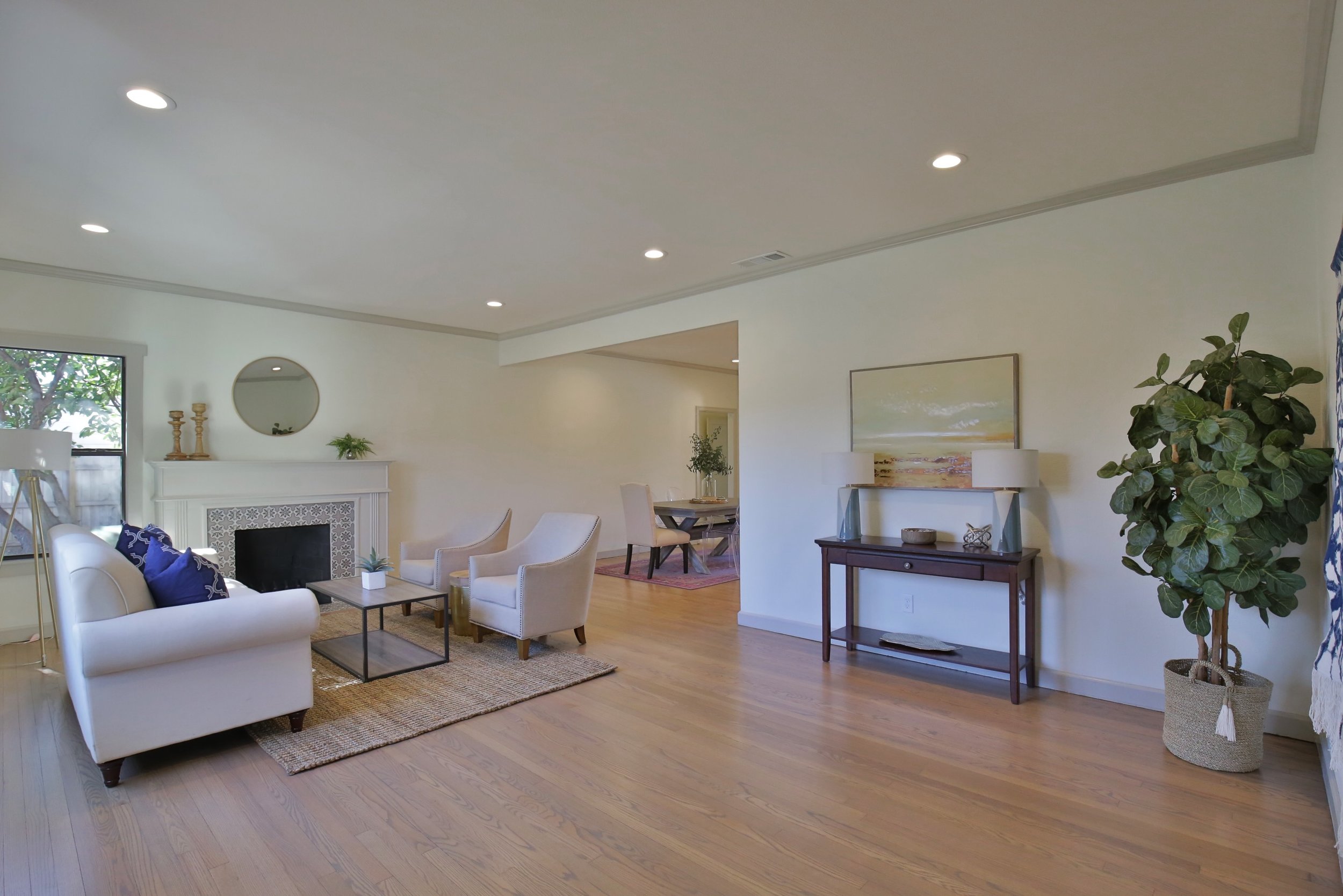
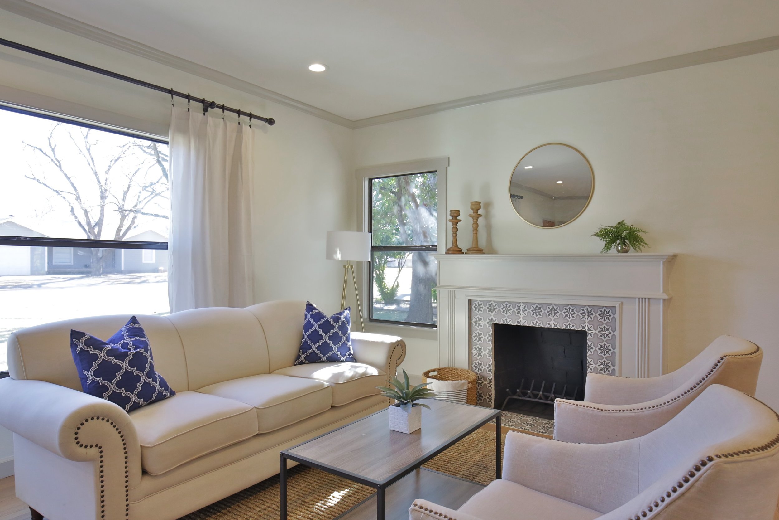
In the living space we had B E A U T I F U L hardwood floors! We were determined to keep them which took a lot of patching and sanding to bring out their glory, but I'd say it was worth it! We used a combination of white and brown stain that produced a natural wood look color. I LOVE how they turned out! We opened up the space between the living and dining room to have more of an open concept feel, but left the wall up between the kitchen and living area. Open concept is great, but its nice to have some separation in rooms. We painted the walls Swiss Coffee by Benjamin Moore and the trim Revere Pewter by Benjamin Moore.
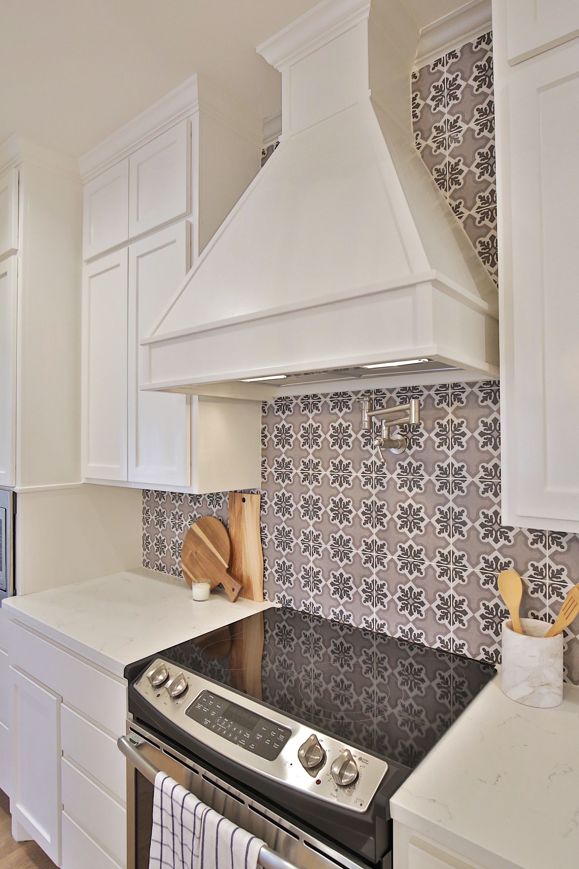
The only thing we changed here was the tile and paint! Such an easy update for any house and packs a huge punch. Now the fireplace is a statement piece for this living room and I'm obsessed with this tile! We also used it on the backsplash in the kitchen and really tied those two spaces together. The tile is Merola brand that Home Depot carries and I love it! Its actually a porcelain tile that looks like cement, win win in my book! The paint color is Revere Pewter by Benjamin Moore.
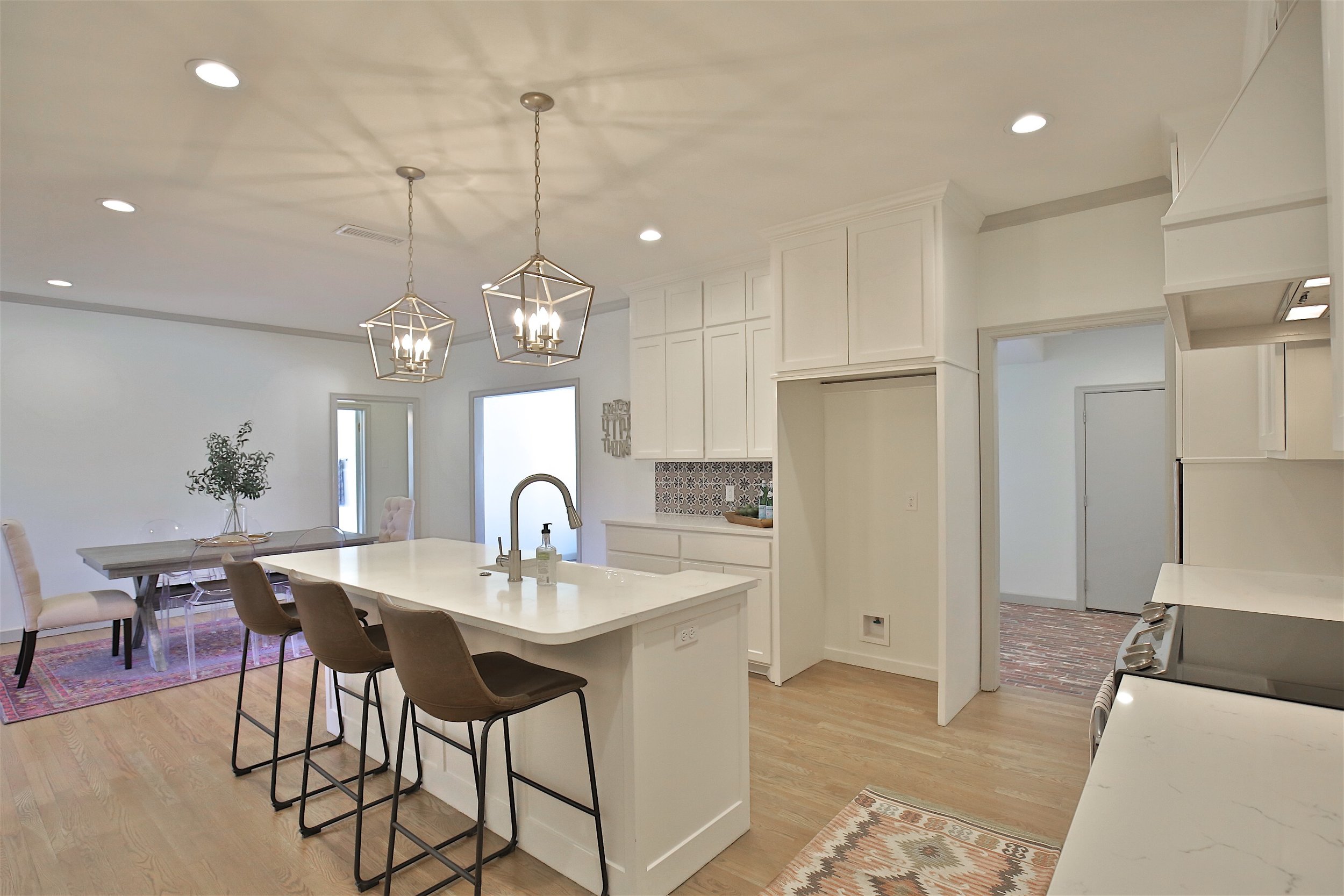
Opening up these walls really made the house flow much better and makes the space look so much bigger! After a little bit of patching we were able to keep the hardwoods throughout the kitchen *drool*. I think having hardwoods in the kitchen really warms up the space, it felt so home(y) when you were in it! I can imagine the fun meals and dinners that are going to be held in here!
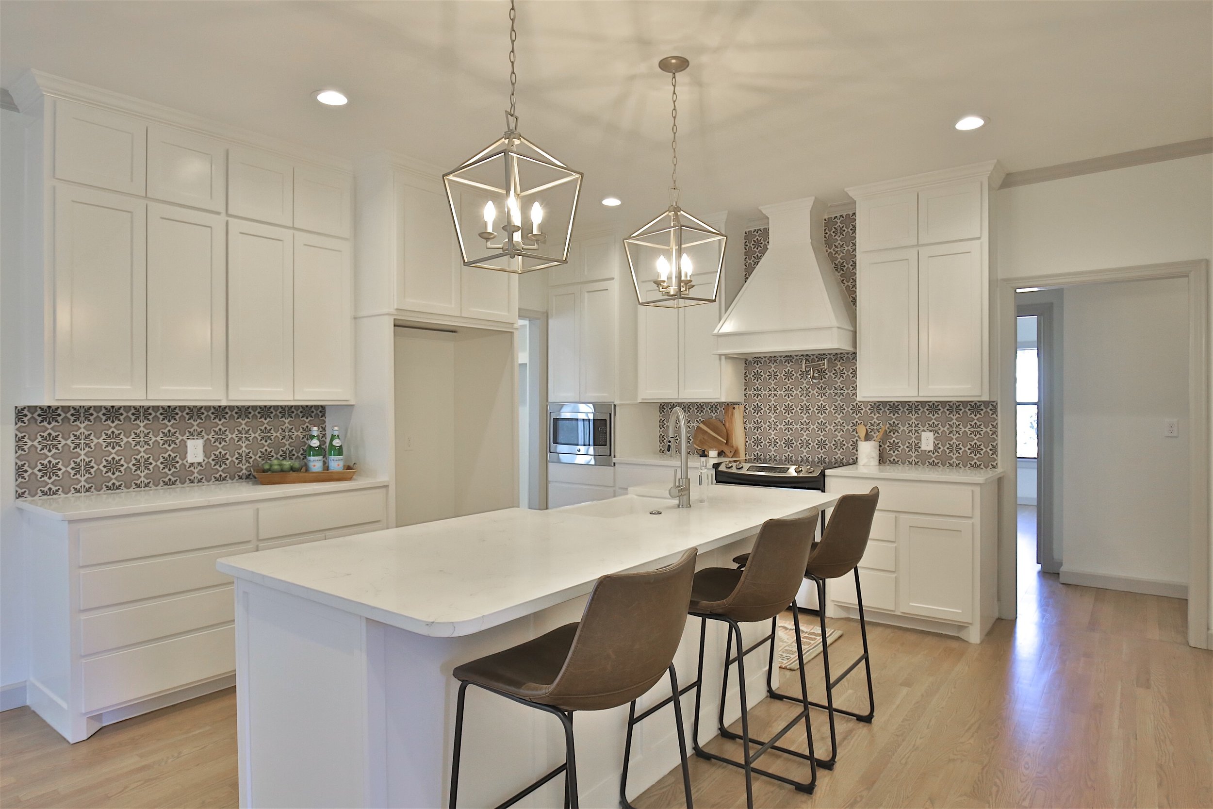
Custom cabinets, quartz countertops, farmhouse sink, I mean, this kitchen is a D R E A M! Throughout the whole house we wanted to keep the character of the era this house was built, but with a modern play on the finish out pieces. On the cabinets we added smaller doors on the upper cabinets, which was a poplar design in the 1940's. The cabinets are painted Acoustic White by Kelly Moore.
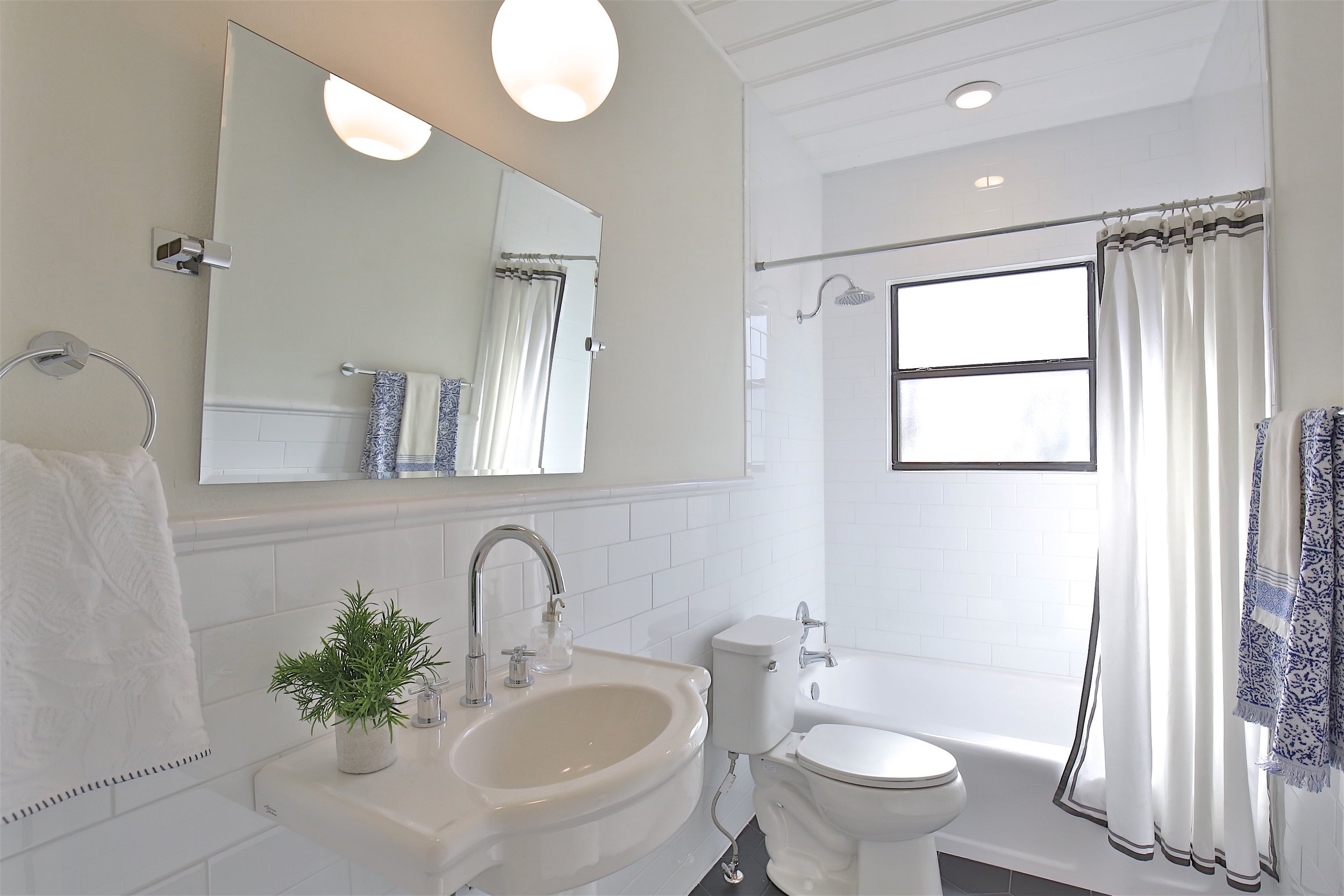
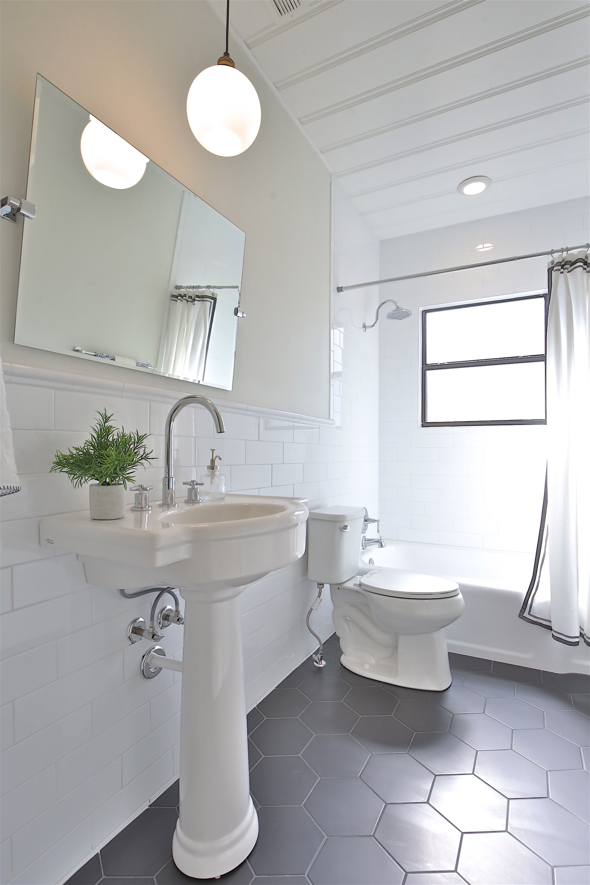
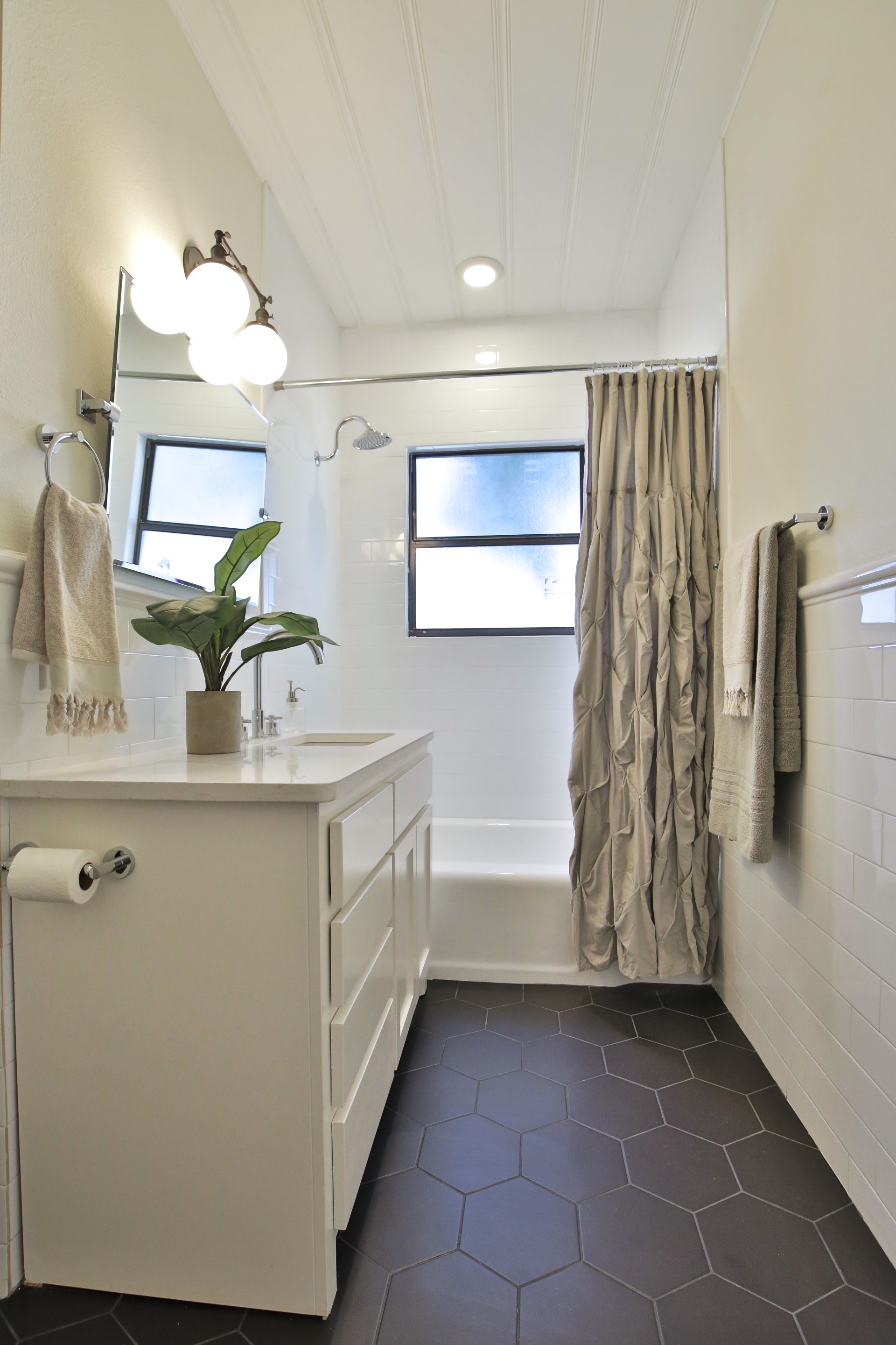
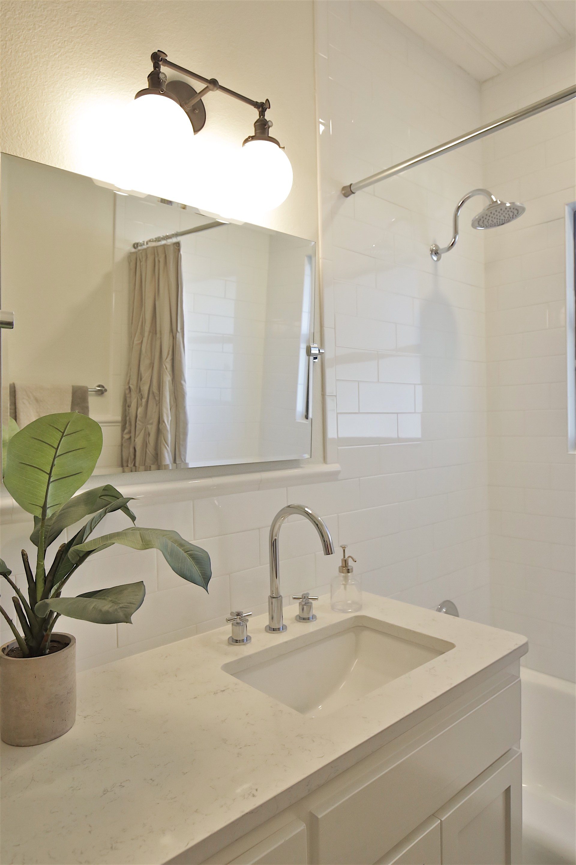
As much as I wanted to go back with all pedastool sinks, we needed storage! So we compromised having one bathroom with a large vanity and the other bathroom with a pedastool sink. You can't see it very well in this picture, but the pendant vanity light has a black and gold finish on it, but the rest of the fixtures are polished brass. I was initially worried about mixing those finishes, but it turned out perfectly!
The black hexagon tile floors and large scale subway tile was another play on the older design with a modern twist. Which bathroom is your favorite?
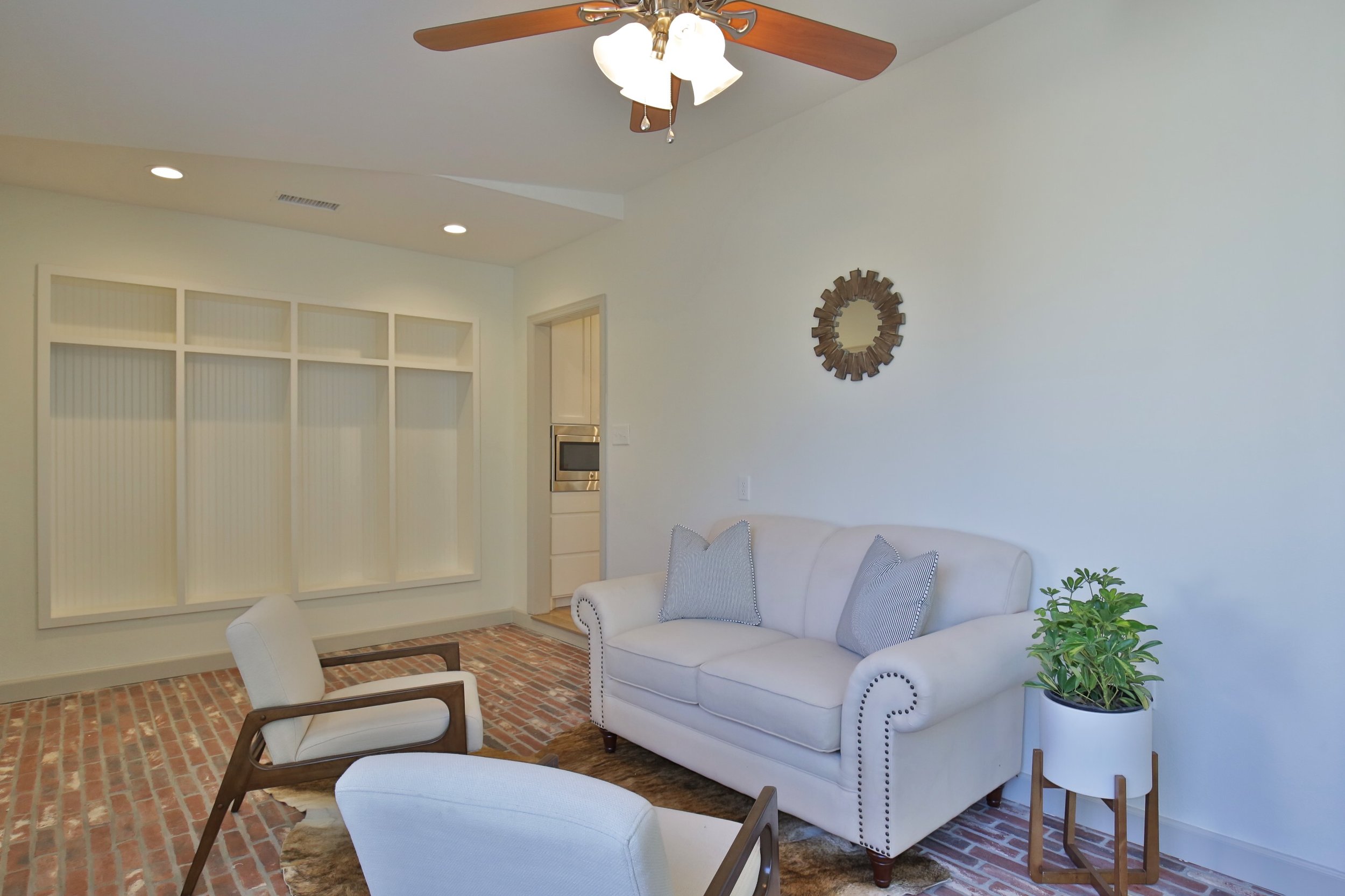
This sun porch and mud room is so fun! We added the brick pavers for more character and I dont think anyone can tell if they are original or not! It's such a timeless look!
I had to take the opportunity with this garage to add gooseneck lights over each door! The black finish on the goosneck lights provided good contrast and also tied in well with the windows.
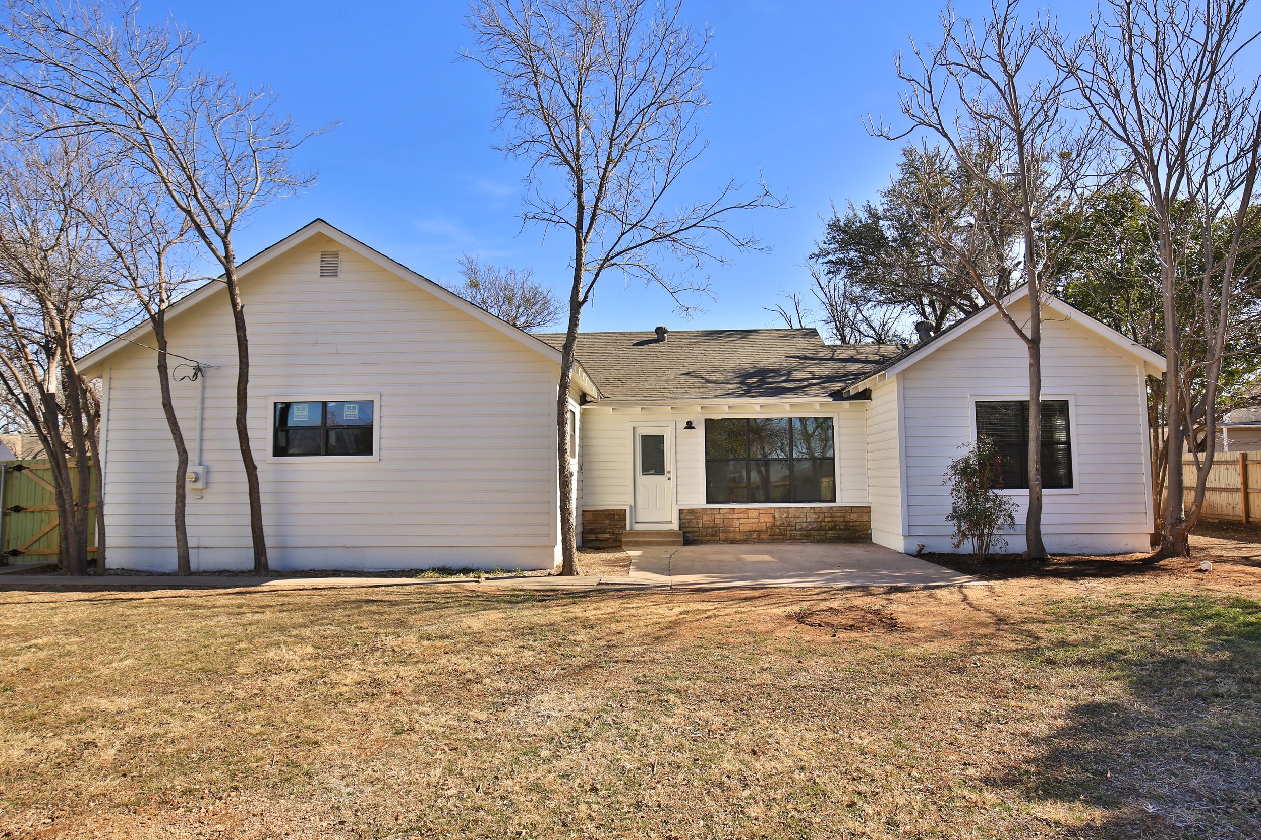
This photo cracks me up!! The landscaping was SO overgrown you cant even see the house, but yes, both of these pictures are taken from the same spot! To say Jon had his hands full here is an understatement, but he kept the good stuff and cut out the junk. The walls around the porch had cedar shake on them which was cute, but in really bad condition so we ended up having to remove all of it. This patio area and backyard is so cute!
We hope y'all love it! When I look at this house I see many months of hard work and a beautiful outcome. For the surrounding community it adds value to each of their homes, as well. We feel so blessed with each house to have the opportunity to work on them and make them better then new!


